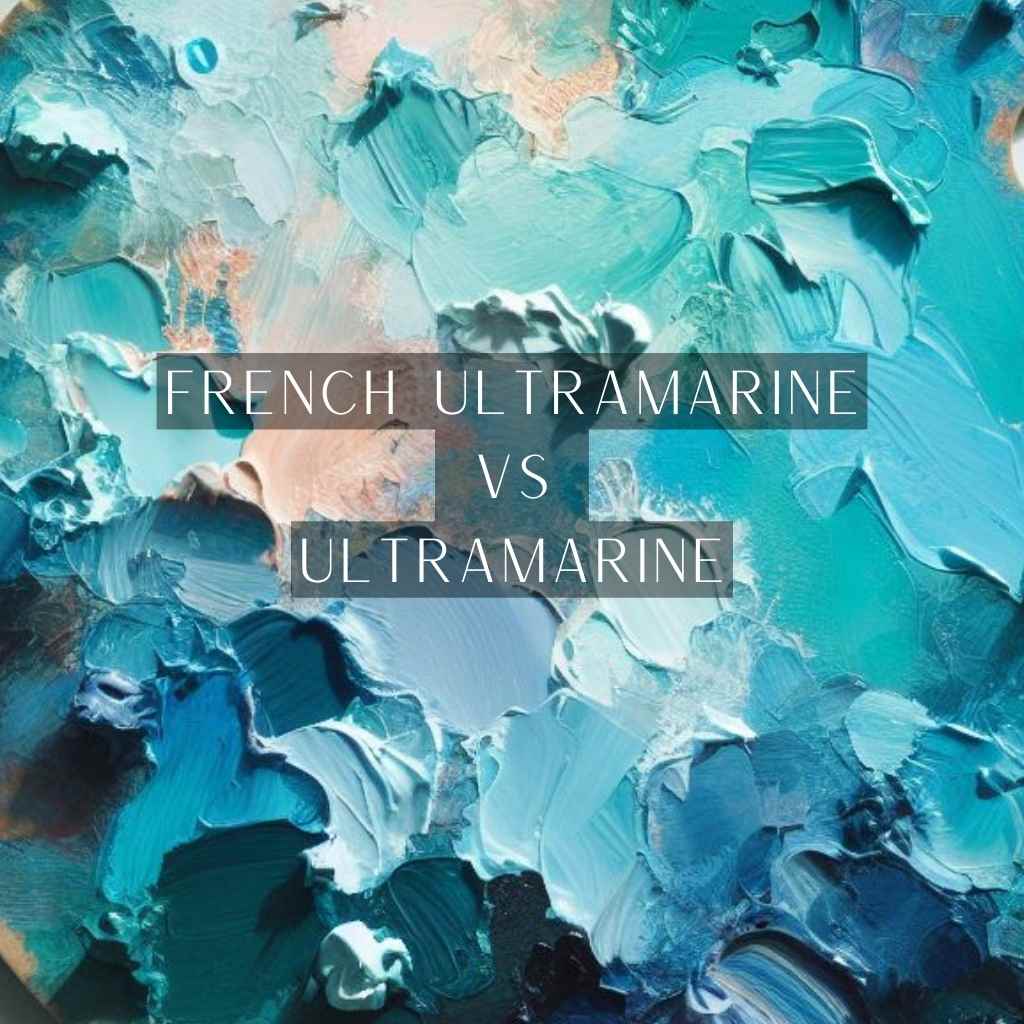
Are you an artist searching for the perfect shade of blue to bring your vision to life? The choice between French ultramarine vs ultramarine can be a defining moment in your creative journey.
The world of art is a symphony of color, and this choice is your conductor’s baton. But it’s not just about blue; it’s about depth, intensity, and the subtle dance of hues on your canvas.
French Ultramarine, the timeless classic, has a bit warmer tone and Ultramarine has a bit cooler tone, its versatile counterpart, beckons with unique characteristics, and it’s your prerogative to unlock their secrets.
Prepare to explore where we decode the nuances of these captivating blues, helping you paint your artistic dreams in the truest strokes.
French Ultramarine: The Classic Blue
French Ultramarine, once sourced exclusively from lapis lazuli, was a precious commodity. Extracting this pigment was a painstaking process, involving grinding the rare mineral into a fine powder.
Modern production methods have revolutionized the availability of French Ultramarine. Through a combination of chemical synthesis and advanced milling techniques, a consistent and high-quality pigment is achieved.
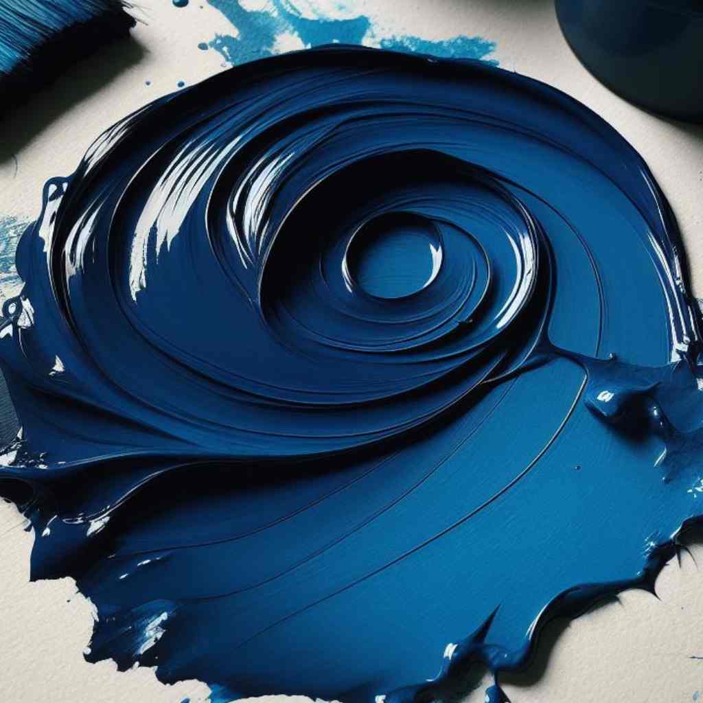
French Ultramarine boasts an unparalleled intensity. Its deep, almost regal, blue captivates the eye, making it a sought-after choice for artists seeking to infuse their works with a profound emotional depth.
Ultramarine: A Diverse Spectrum
The ultramarine family has expanded to include both synthetic and natural variants. Understanding the distinctions between them is crucial for artists seeking specific color properties.
Engineered through meticulous chemical processes, synthetic ultramarine pigments offer a wide range of hues. They are prized for their consistency and affordability.
Unlike the consistent hue of French Ultramarine, generic ultramarines may display subtle variations. Artists can use these nuances to achieve specific tonal effects.
French Ultramarine vs Ultramarine: Visual Comparison
Regarding ultramarine pigments, the nuances in color characteristics can significantly impact an artwork’s final outcome. Understanding the distinctions between French Ultramarine and its generic counterpart is crucial for artists seeking to achieve specific visual effects-
Hue and Color Range
The fundamental hue of French Ultramarine exudes a deep, almost regal blue, captivating the eye with its intensity. It often showcases cool undertones, contributing to its distinctive character.
Conversely, generic ultramarines may exhibit subtle variations in shade, leaning towards warmer or cooler tones and it may display undertones that lean towards warmer or cooler hues.
Granulation Effects
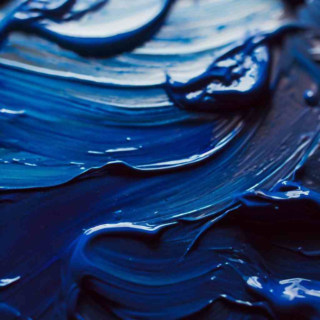
French Ultramarine boasts pronounced granulation effects, creating a unique texture in washes and glazes. This characteristic is highly sought after by artists seeking to add depth and interest to their compositions.
Generic ultramarines, while still exhibiting granulation, may do so with subtlety. This offers a smoother application, which can be advantageous for specific artistic styles and techniques.
Opacity and Transparency
French Ultramarine, known for its transparency, lends itself beautifully to layering and glazing techniques. Its ability to blend seamlessly with other colors allows artists to create subtle transitions and build intricate layers of depth in their artworks.
Generic ultramarines may exhibit varying levels of transparency, requiring artists to adapt their techniques accordingly.
Saturation and Intensity
The sheer intensity of French Ultramarine allows artists to create bold statements on their canvas. Its deep, rich color saturates the eye, evoking strong emotions and commanding attention.
Generic ultramarines, while still vibrant, may not reach the same level of intensity. Artists must consider the desired visual impact of their artwork when choosing between the two options.
Lightfastness and Permanence
French Ultramarine is renowned for its exceptional lightfastness, making it a reliable choice for artists concerned about the longevity of their creations.
However, it’s essential to note that lightfastness may vary among generic ultramarines. Artists should carefully assess the lightfastness of their chosen pigment to ensure the artwork remains vibrant and true to its original form over time.
Mixing and Complementing with Other Colors
Ultramarine pigments, with their captivating blue hues, can be elevated through the art of color mixing and complementing. This process offers a wide array of creative possibilities.
Blending ultramarine with earthy ochres, siennas, and umbers for a balanced, naturalistic palette, particularly effective in landscape painting.
Combine ultramarine with reds for a range of purples, or with yellows for lush greens, allowing artists to convey diverse moods and atmospheres.
Pairing ultramarine with complementary shades like orange for high-impact visuals, or with yellow-orange for a captivating interplay of warm and cool tones.
By understanding the principles of color theory and experimenting with different combinations, artists can leverage the unique properties of ultramarine pigments to create artworks that resonate on a profound visual level.
French Ultramarine and Ultramarine: Artistic Application
Mastering the application of ultramarine pigments is key to bringing out their full potential on the canvas. Here are some essential tips to ensure your artwork shines:
- Brush Techniques: Experiment with different brush strokes to achieve varying textures and effects. A fine-tipped brush allows for precise detailing, while a broader brush can create sweeping, expressive strokes.
Play with dry brushing, stippling, and glazing techniques to add depth and dimension to your work.
- Layering and Glazing with Ultramarine Pigments: Ultramarine’s transparent nature makes it ideal for layering and glazing. Apply thin washes of the pigment to build up depth and richness.
Allow each layer to dry before adding subsequent ones for a luminous, multi-dimensional effect. Mix ultramarine with a medium for glazing to achieve subtle transitions and create a captivating play of light.
- Achieving Desired Effects in Different Mediums: Understanding how ultramarine behaves in various mediums is crucial for achieving your artistic vision.
In watercolors, it flows gracefully, while in oils, it maintains its rich hue and blends harmoniously with other colors.
In acrylics, it provides a strong, opaque presence, and in gouache, it offers a powerful tool for creating bold, solid areas of color. Familiarize yourself with how ultramarine interacts with your chosen medium to maximize its impact.
FAQs
- Can I achieve similar color results with French Ultramarine and Ultramarine in my artwork?
While both pigments belong to the blue family, they may produce slightly different shades. French Ultramarine tends to have a deeper, more intense blue, while Ultramarine variants may exhibit subtle variations.
- How artworks created with French Ultramarine and Ultramarine should be preserved?
Implementing proper framing, display, and conservation techniques is crucial for preserving artworks featuring ultramarine pigments. Shielding the artwork from excessive light exposure and environmental factors ensures that its visual integrity endures for generations to come.
- Are there any specific considerations for mixing French Ultramarine and Ultramarine with metallic pigments or mediums?
When mixing with metallic pigments or mediums, it’s important to conduct small-scale experiments to understand how the pigments interact. This allows you to achieve the desired visual effects in your artwork.
- Are there any specific historical artworks or artists known for their use of French Ultramarine or Ultramarine pigments?
Yes, historical artists like Vermeer and other Dutch Masters were known to use Ultramarine in their masterpieces. Additionally, French Ultramarine has been favored by many renowned artists throughout history.
Final Thoughts
As we draw the curtains on our exploration of French ultramarine vs ultramarine, the tapestry of artistic nuance becomes ever more intricate.
The choice between them transcends mere pigment; it is a dialogue between heritage and innovation, tradition and adaptability. Ultimately, the decision rests in the hands of the artist, guided by their vision and intent.
With this, we find that the true mastery lies not only in the pigments themselves but in the hands that wield them, transforming mere colors into profound expressions of artistry.