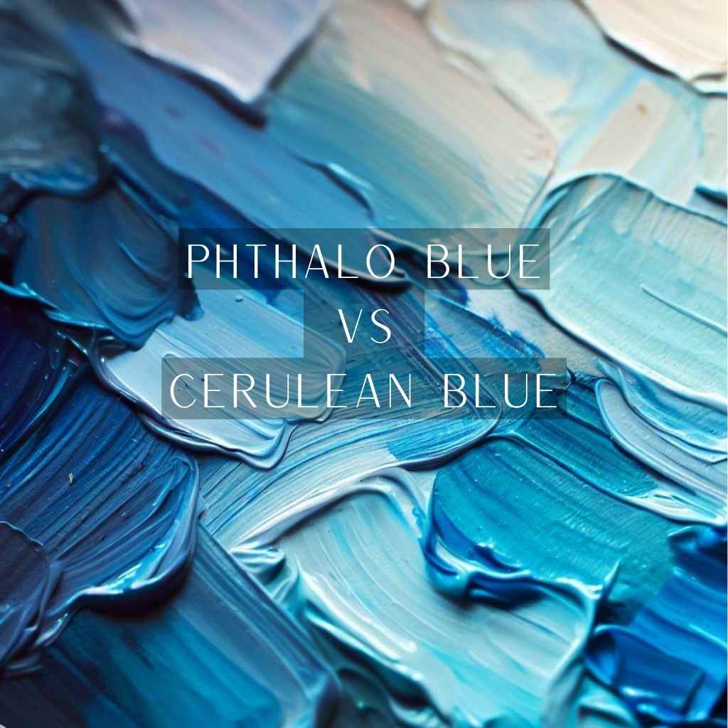
In the mesmerizing world of artistry, where colors morph into emotions and strokes tell stories, a timeless battle unfolds: Phthalo Blue vs Cerulean Blue.
It’s a conundrum artists across generations have faced—a choice that could redefine a masterpiece. In this kaleidoscopic journey, we delve into the very essence of these blues, their compelling dichotomy, and the magnetic pull that makes them the linchpin of a colorist’s saga.
Whether you’re an aspiring painter seeking the ideal pigment for your latest canvas or an art enthusiast captivated by the magic of hues, prepare to embark on an expedition that will illuminate the enigmatic dance between Phthalo Blue and Cerulean Blue.
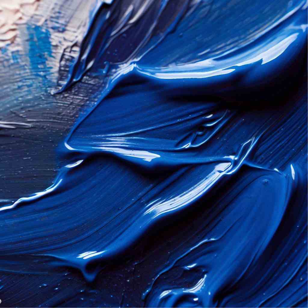
Phthalo Blue: The Vivid Marvel
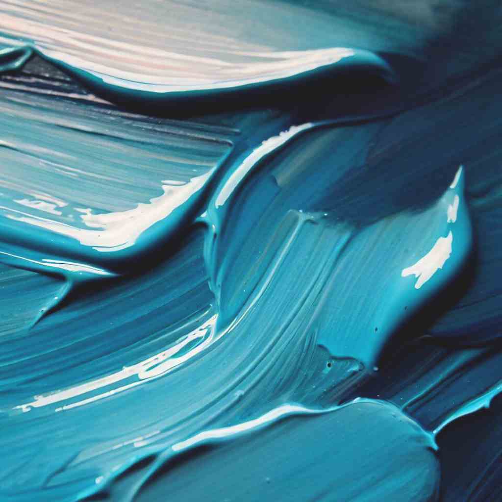
Phthalo Blue, stemming from its complex chemical origins, possesses an almost mystical vibrancy. Derived from copper phthalocyanine, this pigment’s molecular structure interacts uniquely with light, resulting in its intense and captivating color.
With its high tinting strength and unparalleled vibrancy, Phthalo Blue commands attention. It’s a color that commands presence, dominating the canvas with its vivid essence, making it a favorite for artists who seek to make a bold statement.
In acrylic and oil painting, Phthalo Blue emerges as a powerhouse, enabling artists to create dynamic and expressive strokes. Its transparent nature, however, finds its true calling in watercolor, where it lends itself to delicate washes and seamless blending.
Cerulean Blue: The Serene Elegance
Cerulean Blue’s name refers to the Latin word “caelum,” meaning sky or heaven. It’s historical significance and serene hue has earned it a place of honor in the artist’s palette, where it embodies the gentle beauty of the sky and the calming embrace of water.
Cerulean Blue may lack the fiery intensity of its counterparts, but its soft, almost elusive charm is what captures the hearts of artists. With a delicate balance between blue and green undertones, Cerulean Blue’s ethereal quality is hard to replicate.
As an exceptionally versatile color, Cerulean Blue gracefully adapts to various artistic visions. Whether it’s the expanse of a serene sky or the reflective surface of a tranquil lake, this hue excels in capturing the subtleties of nature’s beauty.
Phthalo Blue vs Cerulean Blue: Comparative Analysis
When it comes to the world of pigments, the intricacies lie not only in their chemical compositions but also in their artistic implications.
Phthalo Blue and Cerulean Blue, two captivating shades in the artist’s arsenal, offer a fascinating comparative analysis that reveals the depth and nuances of color’s influence in the world of art-
Pigment Composition: Phthalo vs Cerulean
Pigment composition sets the foundation for the visual impact of color. Phthalo Blue’s roots in copper phthalocyanine bestow it with an electrifying vibrancy that is further enhanced by its unique molecular structure.
Cerulean Blue, in contrast, derives its name from “caelum,” meaning sky and its molecular arrangement contributes to its subdued yet alluring hue.
Color Intensity and Transparency: A Delicate Balance
The interplay of color intensity and transparency significantly affects the visual outcome of a pigment. Phthalo Blue, with its captivating intensity, manages to maintain a delicate balance of transparency that allows for fascinating layering effects.
On the other hand, Cerulean Blue’s gentle opacity lends it an ethereal quality that makes it a master of subtle transitions and soft gradients.
Mixing Possibilities: Creating Secondary and Tertiary Hues
A color’s versatility lies in its ability to blend seamlessly with others. Phthalo Blue excels in this aspect, giving birth to a plethora of secondary and tertiary hues with its bold and vibrant nature.
In contrast, Cerulean Blue’s softness facilitates nuanced mixing, providing a range of delicate shades that resonate with quiet elegance.
Lightfastness and Permanence: Longevity on Canvas
The longevity of an artwork hinges on the lightfastness and permanence of its pigments. Here, Phthalo Blue exhibits its synthetic stability, ensuring its brilliance perseveres over time.
While Cerulean Blue’s lightfastness may vary based on formulation, it’s imperative for artists to choose high-quality versions to ensure the lasting legacy of their creations.
Emotional Resonance: The Psychology of Phthalo and Cerulean
The colors an artist selects play a pivotal role in evoking emotions and conveying messages. Phthalo Blue’s boldness often ignites strength and intensity in composition, while Cerulean Blue’s gentleness weaves a sense of calm and tranquility into the artistic narrative.
When combined, these blues create emotional symphonies. Phthalo Blue’s intensity complements Cerulean Blue’s softness, offering a multidimensional experience.
This interplay mirrors life’s complexities, enriching artworks with layered emotions. The artful blend of strength and calmness allows for a profound connection between the artwork and its audience.
Wrapping Up
As the final brushstroke finds its place and the canvas transforms into a narrative, we arrive at the crescendo of our chromatic exploration—Phthalo Blue vs Cerulean Blue.
The realm of pigments has been unmasked, revealing these two titans in their nuanced splendor. Standing at the intersection of vibrancy and subtlety, we’ve witnessed the magnetic pull of Phthalo’s intensity and Cerulean’s tranquility.
Armed with the insights gained from this voyage, your palette is elevated, your choices enriched, and your creative endeavors empowered.
So, as you embark on your next canvas, remember the dance between these blues, for they are not mere colors, but the architects of your emotions and the narrators of your vision.