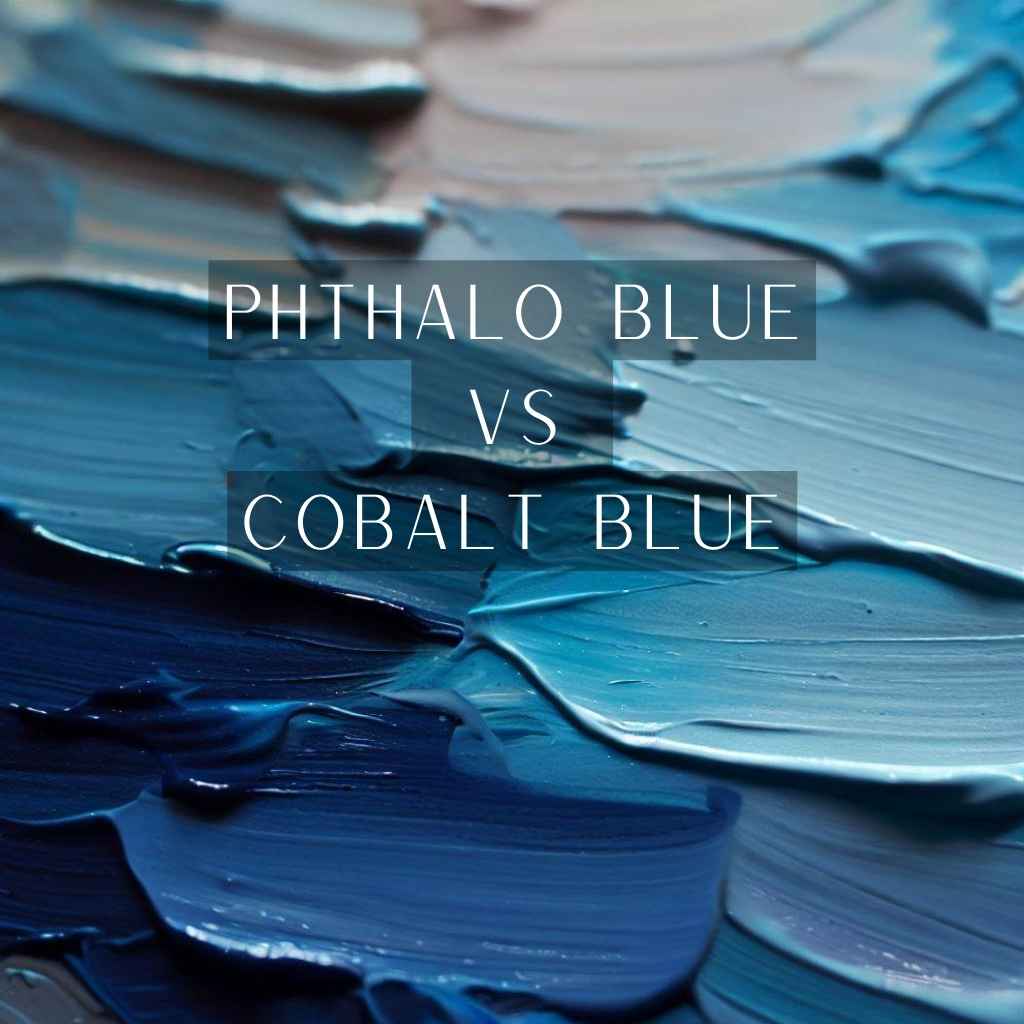
In the vivid tapestry of art, where colors intertwine to evoke emotions, few hues stand as boldly as phthalo blue and cobalt blue.
As brush meets canvas, questions arise. Which blue possesses the power to captivate the viewer’s gaze? Which offers the elusive balance between transparency and opacity?
In this exploration, we’ll delve into the world of phthalo blue vs cobalt blue, unearthing their histories, unraveling their characteristics, and guiding you toward informed artistic choices.
Get ready to journey through the captivating realm of color as we compare these enigmatic blues, igniting your creativity with the insights that lie ahead.
Phthalo Blue: The Vibrant Marvel
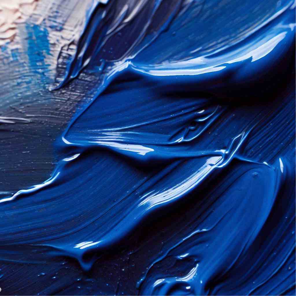
Phthalo Blue, derived from the Greek word “phthalo,” meaning “deep,” has a captivating history. Developed as a synthetic pigment in the mid-20th century, its journey begins in laboratories rather than the natural world. This modern blue, born from innovation, quickly captured the hearts of artists seeking vibrant, intense hues.
Phthalo Blue’s vibrant and intense character emerges from its chemical structure, which grants it a remarkable saturation.
Its electric energy on the canvas cannot be ignored, drawing viewers into a world of bold expression. When this blue dances with light, it evokes emotions ranging from excitement to tranquility.
Cobalt Blue: A Timeless Classic
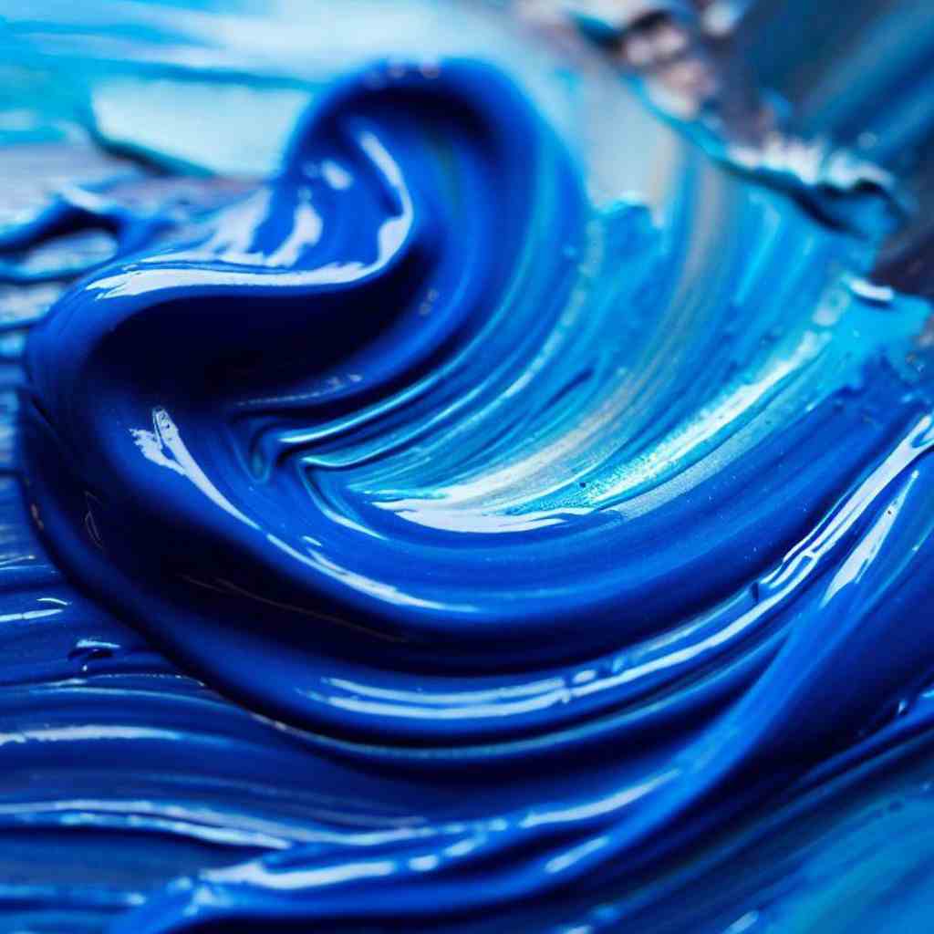
Unlike Phthalo Blue, Cobalt Blue’s origins are anchored in history, stemming from the ancient mines of Persia.
This blue treasure was used to adorn ceramics, stained glass, and textiles, encapsulating the rich history of civilizations that valued its depth. It remained a prized pigment, cherished for its rarity and beauty.
Cobalt Blue boasts a remarkable depth that resonates with the hues of endless skies and boundless oceans. Its color penetrates the canvas, imbuing artworks with a sense of timeless grandeur. Its opacity lends itself to creating solid, powerful statements, and it effortlessly evokes calm and serenity in tranquil scenes.
Phthalo Blue vs Cobalt Blue: Visual Comparison
A painter’s palette is a realm of boundless choices, where every hue tells a story. Here is the visual comparison of Phthalo Blue and Cobalt Blue, witnessing the interplay of their shades, depths, and the emotions they evoke on the canvas-
Transparency and Opacity
Phthalo Blue’s transparent nature transforms the canvas into a layered narrative. When applied in thin washes, it allows underlying colors to shine through, creating a dynamic interplay.
This transparency lends itself to techniques like glazing, where layers of color form intricate mosaics that shift with changes in light.
Cobalt Blue’s opacity offers artists a tool to craft solid, powerful statements on the canvas. Its ability to cover underlying layers creates a sense of depth, allowing artists to build forms and textures with precision.
This opacity also contributes to its role in realistic portraiture, where delicate transitions of light and shadow demand careful layering.
Color Palette and Mixing
Phthalo Blue is not just a color; it’s a conductor in the orchestra of pigments. It harmonizes beautifully with warm and cool tones, but its true magic lies in the vivacious greens and teals it creates.
When it meets other colors, it elevates them to new dimensions, dancing across the canvas with an unparalleled vivacity.
Cobalt Blue is an enigma in the world of color mixing. Its depth adds subtlety to its interactions, creating subdued and nuanced mixtures. When Cobalt Blue encounters other colors, it tempers their intensity, guiding them toward a harmonious equilibrium. Its influence in tertiary color creation is a testament to its adaptable nature.
Permanence and Lightfastness
Phthalo Blue’s modern heritage prompts questions about its ability to stand the test of time, while Cobalt Blue’s historic resilience ensures that artworks using this pigment will continue to inspire for generations.
The lightfastness of pigments is a journey through time. Phthalo Blue, with its synthetic origins, needs to prove its endurance over the years, while Cobalt Blue carries the weight of centuries of artistic heritage.
Palette Harmony: Warm and Cool Undertones
Phthalo Blue’s cool nature makes it a beloved member of cool color palettes. It harmonizes seamlessly with fellow cool blues, greens, and violets, creating compositions that evoke tranquility and freshness.
Its transparency allows it to weave through other cool tones, enhancing the palette’s depth and complexity.
Cobalt Blue, with its unique depth, is not confined to a singular palette. It’s equally at home within both warm and cool undertones, bridging the gap between worlds.
Its adaptability makes it a masterful addition to palettes seeking to strike a balance between the warmth of life and the coolness of reflection.
Color Psychology and Emotional Impact
The psychology of blue elicits feelings of trust, tranquility, and stability, creating a canvas for artists to evoke emotions that resonate with the human experience.
Phthalo Blue and Cobalt Blue, though both part of the blue family, evoke distinct emotions. Phthalo Blue’s vibrancy resonates with exuberance and excitement, while Cobalt Blue’s depth and serenity invite introspection and contemplation. The emotional impact of these pigments influences the stories artists tell and the connections they forge.
Phthalo Blue finds its voice in energetic and dynamic artworks, lending itself to vibrant abstract compositions that radiate enthusiasm. Cobalt Blue, with its tranquil undertones, is a conduit for calm introspection, perfect for capturing quiet moments of reflection and serenity.
Phthalo Blue and Cobalt Blue: Artistic Applications
Phthalo Blue and Cobalt Blue find their voices across diverse art styles and mediums, painting landscapes, portraits, and abstract dreams with their distinct palettes-
- Abstract Art and Modern Expressionism with Phthalo Blue: In the realm of abstract art, Phthalo Blue is a cherished tool for artists who seek to convey emotions and concepts beyond the realm of the literal.
Its vibrancy speaks the language of emotions, and its transparency allows layers to intertwine, creating an intricate narrative that unfolds with every gaze.
- Capturing Water and Skies in Landscapes with Phthalo Blue: Landscapes breathe with life when Phthalo Blue takes center stage. It conjures the essence of water, mirroring its depth and shimmer. The skies become vast expanses of dreams, where clouds and horizons meet in a symphony of cool hues.
Through the transparency of this pigment, artists capture the elusive dance of light on water.
- Medium-Specific Tips for Phthalo Blue: For acrylic artists, blending Phthalo Blue with mediums can achieve dreamy effects, allowing the pigment’s vibrancy to play with textures.
In oil painting, layering this transparent blue can build complex color harmonies. Watercolor enthusiasts find its translucence a treasure for creating delicate washes and intricate details.
- Cobalt Blue in Portrait and Figure Painting: Cobalt Blue whispers stories of timelessness onto portraits and figures. It enhances the play of light and shadow, sculpting features with an air of elegance.
In portraiture, it captures the intricacies of skin tones, while in figure painting, it contributes to the nuanced portrayal of form and emotion.
- Depicting Depth and Distance in Landscapes with Cobalt Blue: Cobalt Blue’s depth finds its true calling in the vast landscapes that stretch into the horizon. When blended into distant hills and mountains, it mimics the cool embrace of atmospheric perspective.
It evokes the grandeur of nature’s vastness, creating a sense of awe and tranquility.
- Contemporary Art with Cobalt Blue: In the hands of contemporary artists, Cobalt Blue is a catalyst for experimentation. It ventures into unexpected realms, marrying tradition with innovation.
Mixed media works, installations, and unconventional materials find an unexpected ally in this timeless hue, proving that its legacy is as alive as ever.
FAQS
- Can I mix Phthalo Blue and Cobalt Blue to create unique shades?
Absolutely! The interplay of these two blues opens the door to a realm of possibilities. Mixing them can lead to captivating tertiary colors, adding depth and nuance to your palette. Experimentation is the artist’s playground.
- Phthalo blue or cobalt blue, which pigment is more suitable for glazing techniques?
When it comes to glazing, the transparency of Phthalo Blue shines. Its ability to layer delicately while retaining its vibrancy makes it a favorite for creating stunning visual effects through multiple layers. Cobalt Blue, with its opacity, can also contribute to glazing with a different artistic approach.
- Can phthalo blue or cobalt blue be used in combination with metallic pigments?
Absolutely! The marriage of Phthalo Blue or Cobalt Blue with metallic pigments can create stunning visual effects. The interplay of shimmer and hue adds a touch of magic to compositions, elevating the artwork’s visual impact.
- How do Phthalo Blue and Cobalt Blue respond to different lighting conditions?
These blues interact with light in unique ways. Phthalo Blue’s vibrancy shines brightly under direct light, while Cobalt Blue’s depth is enhanced in ambient or diffused lighting. Understanding how light transforms these hues empowers artists to control the visual impact of their work.
Conclusion
As our chromatic exploration comes to a close, the canvas of understanding has been enriched with the captivating hues of phthalo blue and cobalt blue.
From the inception of their pigments to the strokes of the artist’s brush, these blues have woven narratives that span history, art movements, and emotions. Through the lens of transparency and opacity, vibrancy and depth, we’ve delved into the symphony of colors that dance upon the canvas.
The clash and collaboration of phthalo blue vs cobalt blue have created a masterpiece of insight, empowering you, the artist, to wield these pigments with purpose and precision.
With your palette now adorned with knowledge, you stand at the threshold of artistic choice.