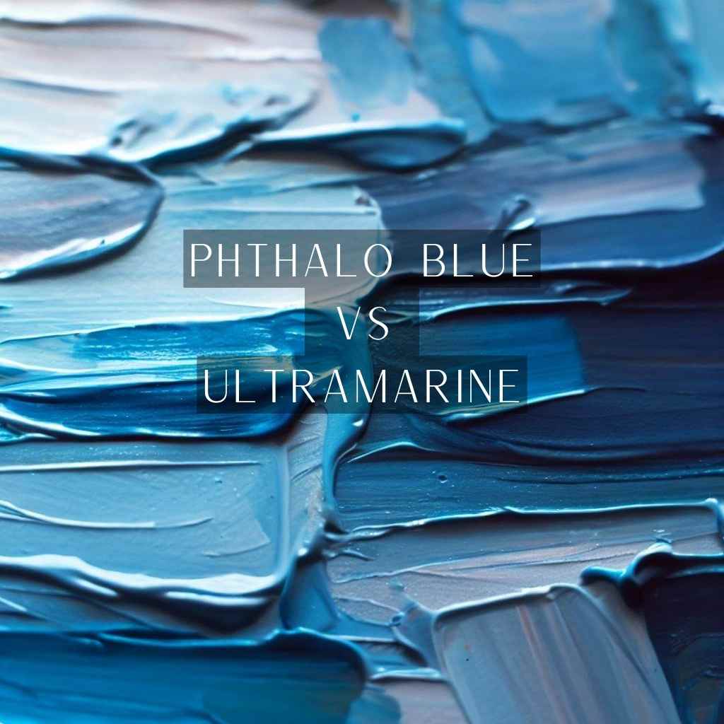
In this chromatic realm, two illustrious shades, phthalo blue and ultramarine, emerge as the protagonists, each boasting a distinct personality and a captivating aura.
But here’s the crux: which of these mesmerizing blues truly deserves the spotlight in your artistic endeavors? As you stand at the threshold of creativity, the question lingers: How do you decipher the intricate dance between phthalo blue vs ultramarine?
Fear not, for in this blog post, we embark on a journey that unravels their mysteries, equipping you with the insight to wield their nuances with finesse.
Prepare to be captivated, enlightened, and empowered, as we navigate the depths of these blues and discover the artistry they harbor.
What is Phthalo Blue?
Phthalo Blue, a relatively modern addition to the artist’s palette, was synthesized in the early 20th century. Its journey from the laboratory to the easel is a testament to human ingenuity in the pursuit of creative expression.
At the heart of Phthalo Blue’s brilliance lies a complex chemical composition. This copper-based pigment resonates with the wavelength of light that we perceive as blue, offering artists a vivid and arresting hue.
What is Ultramarine Blue?
Ultramarine’s tale begins amidst the riches of ancient trade routes, where lapis lazuli was sourced from distant lands. It was treasured by royal patrons and esteemed for its stunning blue color, which symbolized wealth, power, and divine connections.
The journey of lapis lazuli from gemstone to pigment was no trivial task. The labor-intensive process of grinding the stone down into a fine powder unveiled the gem’s hidden secret—a vivid blue pigment that held the promise of transforming art.
Phthalo Blue and Ultramarine Blue: Comparison
In the realm of blue pigments, the dichotomy between phthalo blue and ultramarine unfolds a fascinating narrative of contrasts and choices-
Color Characteristics: Radiance vs. Tranquility
The visual impact of Phthalo Blue and Ultramarine diverges dramatically. Phthalo Blue enters the scene with an explosion of color, its radiant and electrifying hue demanding immediate attention.
It possesses an almost otherworldly intensity, capable of capturing the eye and infusing artwork with energy and vibrancy.
In contrast, Ultramarine offers a more contemplative experience. Its serene and deep blue resonates with a sense of calm and introspection. The hue seems to recede into the distance, drawing viewers into its mysterious depths.
Handling and Mixing: From Palette to Canvas
The artist’s interaction with these pigments presents distinct challenges and opportunities. Phthalo Blue’s high tinting strength demands careful handling.
A tiny drop can significantly alter a mixture’s color, requiring a delicate touch to achieve the desired shade. It’s a pigment that commands attention, urging the artist to wield it with precision.
On the other hand, Ultramarine’s more moderate tinting strength offers a more forgiving approach. It allows artists to experiment and layer gradually, giving them the space to blend and achieve nuanced transitions.
This characteristic is particularly valuable when working on pieces that require subtle gradations or gradual shifts in color.
Transparency and Layering: Techniques for Visual Depth
When it comes to layering and building visual depth, these blues each bring their own strengths. Phthalo Blue’s transparency is a tool for artists seeking to create luminous effects. Its ability to layer and glaze allows for the buildup of color while maintaining the underlying layers’ vibrancy.
This lends itself well to techniques that require capturing the play of light, such as creating water reflections or atmospheric effects.
In contrast, Ultramarine’s semi-opaque nature has its own appeal. It doesn’t simply overlay color; it possesses a captivating depth of its own. Layering
Ultramarine can result in a sense of atmospheric perspective and subtle shifts in tonality, contributing to a more nuanced portrayal of space and form.
Lightfastness and Fading: Longevity in the Face of Time
As artworks journey through time, their endurance becomes crucial. Both Phthalo Blue and Ultramarine offer commendable lightfastness, allowing creations to remain vibrant even when exposed to light over the years.
Phthalo Blue’s steadfastness ensures that its bold hues maintain their punch, making it suitable for works meant to make a lasting impact.
However, Ultramarine’s historical journey speaks to its remarkable ability to resist the fading effects of time. Paintings from centuries past still bear its vivid hues, a testament to its resilience against the forces that would dull its brilliance.
Tips and Techniques for Working with Blues
Every stroke is an opportunity to weave a symphony of blues that resonates with your artistic voice. By embracing these expert tips and techniques, you’re equipped to channel their uniqueness and grace onto your canvas-
- Harnessing Phthalo Blue’s Intensity: Phthalo Blue is known for its intense color. To manage its vividness, gradually dilute it. Combining it with complementary colors creates dynamic contrasts that enhance its impact on the artwork.
- Harmonious Blends with Ultramarine: Ultramarine blends well with various colors. Mixing it with warm tones like siennas creates a balanced and inviting palette. The contrast between the cool depth of Ultramarine and warm hues adds harmony to the composition.
- Enhancing Depth with Glazing: Both blues work exceptionally for glazing. Applying thin layers adds luminosity, creating a play of light that gives artworks an ethereal quality. This technique enhances the depth and atmosphere of the piece.
- Palette Knife Textures: Palette knives can be used to experiment with textures. Phthalo Blue brings bold dimension, while Ultramarine contributes subtle nuances. Every stroke with these blues contributes to a unique artistic composition.
Wrapping Up
As the final brushstroke graces the canvas, the crescendo of your artistic journey approaches its zenith.
The profound interplay of Phthalo Blue and Ultramarine has unfolded before your eyes, a chromatic tale of contrasts and harmonies that have breathed life into your creation.
The question that once tugged at your creativity—phthalo blue vs. ultramarine, which to choose?—now finds its resolution in the tapestry of your masterpiece.
With every layer, every stroke, and every subtle blend, you’ve harnessed the uniqueness of each hue, forging a visual narrative that resonates far beyond pigment and canvas.
As this chapter concludes, remember that your artistic journey is one of perpetual exploration, where each choice adds to the symphony of your expression.