
Are you yearning to infuse your artwork with greater depth and impact? Do you long to understand the secrets behind creating harmonious color palettes and breathtaking contrasts?
In this dynamic blog series, we will dive deep into the enchanting realm of color theory in art. We will explore the fundamentals of color, unravel the mysteries of the color wheel, unravel the psychology behind color choices, and discover the techniques used by famous artists to master the art of color.
Prepare to be enthralled by the significance of hues, values, and saturations, and how they intertwine to create visually stunning compositions.
Basics of Color
Colors are created by different wavelengths of light, which are then interpreted by our eyes and brain. This interpretation leads to the visual sensation of color. The color spectrum consists of a range of colors, each with its unique wavelength and energy.
A. Primary Colors
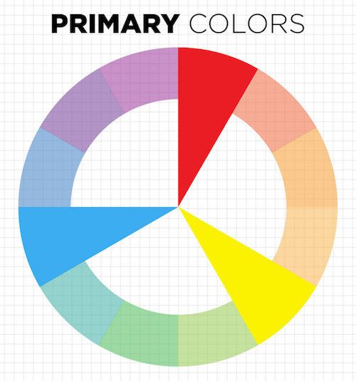
Primary colors are the building blocks of all other colors. They cannot be created by mixing other colors together. The primary colors are red, blue, and yellow. These hues are fundamental in color mixing and play a crucial role in the creation of other colors.
B. Secondary Colors
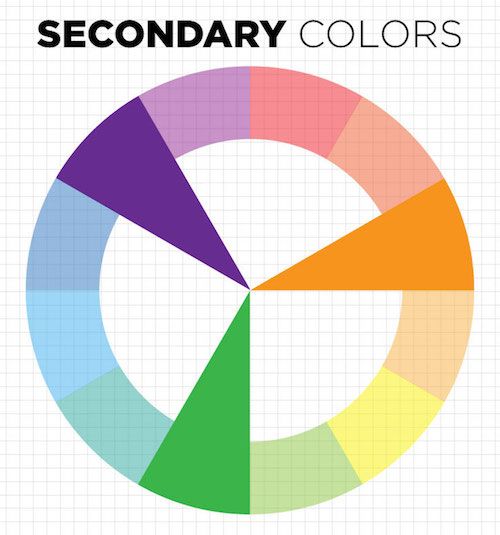
Secondary colors are formed by mixing two primary colors together. The secondary colors include orange (red and yellow), green (blue and yellow), and purple (red and blue). These colors offer a wider range of possibilities for artists to work with.
C. Tertiary Colors
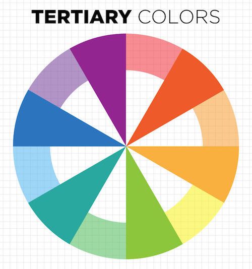
Tertiary colors are created by mixing a primary color with a secondary color. These colors provide even more variety and subtlety in color choices.
Examples of tertiary colors are red-orange, yellow-orange, yellow-green, blue-green, blue-violet, and red-violet. By utilizing tertiary colors, artists can add depth and complexity to their artwork.
D. Hue, Value, and Saturation
Hue refers to the pure spectrum colors found on the color wheel. It represents a specific color name, such as red, blue, or green. Value refers to the lightness or darkness of a color, ranging from light tints to dark shades. Saturation, also known as chroma or intensity, describes the purity or vividness of a color.
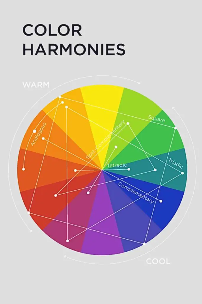
The Color Wheel and Its Significance
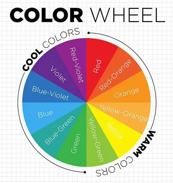
The color wheel is a circular diagram that organizes colors according to their relationships and properties. It showcases the primary, secondary, and tertiary colors, providing a visual reference for understanding color harmony, contrast, and composition.
History and origin of the color wheel: The concept of the color wheel dates back to ancient times, with roots in the color theories of philosophers and scholars such as Aristotle and Leonardo da Vinci.
It was further developed and popularized by influential artists like Sir Isaac Newton and Johann Wolfgang von Goethe. These visionaries laid the groundwork for understanding the relationships between colors and the principles of color harmony.
Primary, Secondary, and Tertiary Colors on the Color Wheel
The color wheel prominently displays primary, secondary, and tertiary colors, aiding artists in identifying their positions and relationships.
The color wheel not only helps artists identify primary, secondary, and tertiary colors, but it also aids in understanding color relationships and harmonies. Complementary colors, which are located directly opposite each other on the color wheel (e.g., red and green, blue and orange, yellow and purple), create a high-contrast and visually striking effect when used together.
Warm and Cool Colors
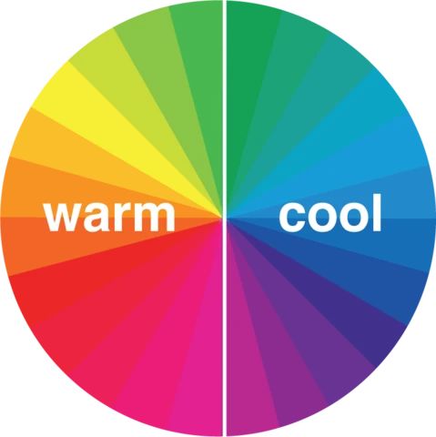
Warm colors, such as red, orange, and yellow, evoke feelings of energy and warmth. On the other hand, cool colors like blue, green, and purple tend to evoke a sense of calmness and serenity. Understanding the distinction between warm and cool colors is crucial for conveying desired emotions in the artwork.
Analogous and Triadic Color Schemes
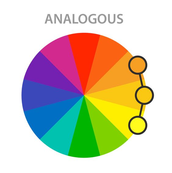
Analogous color schemes involve selecting colors that are adjacent to each other on the color wheel. This creates a sense of harmony and unity in the artwork. For instance, combining shades of blue, green, and turquoise in composition results in a serene and cohesive visual experience.
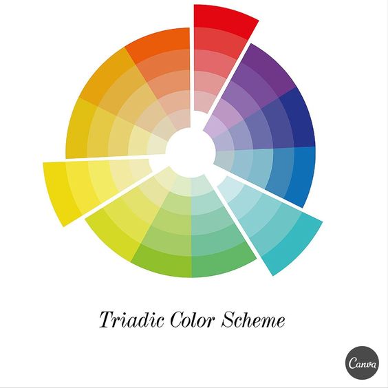
Triadic color schemes involve using three colors that are evenly spaced on the color wheel. For example, selecting red, yellow, and blue creates a vibrant and balanced color combination. Triadic color schemes offer artists a wide range of possibilities for creating visually dynamic compositions.
Color Harmony and Contrast
Color harmony and contrast are essential principles in the art that enable artists to create visually appealing and dynamic compositions. By understanding and applying these concepts, artists can achieve balance, cohesion, and impact within their artwork.
Color Harmony
Color harmony involves the skillful arrangement of colors to create a sense of unity and balance in an artwork.
Artists strive to achieve a harmonious relationship between different colors, ensuring that they complement and enhance one another.
Different techniques to create color harmony in art
Artists employ various techniques to achieve color harmony. One such technique is using analogous colors, which are colors that are adjacent to each other on the color wheel. Analogous color schemes create a smooth and cohesive visual experience.
Another technique is the use of monochromatic color schemes, which involve utilizing variations of a single color. Monochromatic palettes create a harmonious and unified composition.
Monochromatic and complementary color harmonies
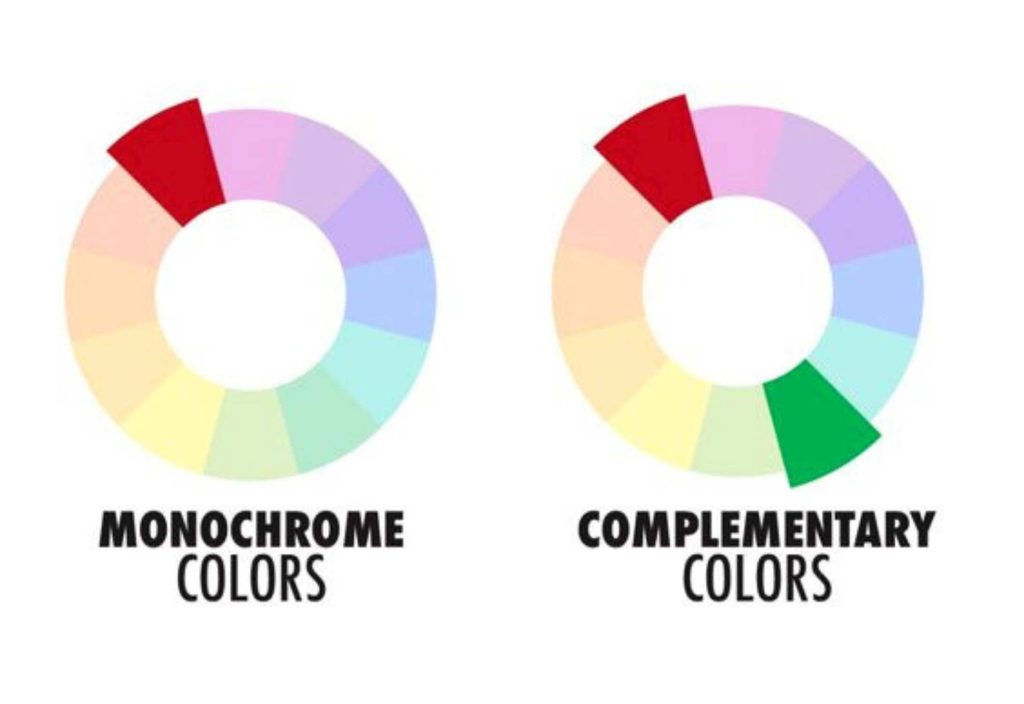
Monochromatic color schemes rely on variations of a single hue, using different tints, tones, and shades to create visual interest and harmony. Complementary color schemes involve pairing colors that are opposite each other on the color wheel. This creates a high-contrast and vibrant visual effect.
Color Contrast
Color contrast involves using colors that differ significantly in terms of hue, value, or saturation to create visual impact and focal points in the artwork.
Contrast can be achieved in various ways, such as using complementary colors, contrasting warm and cool colors, or employing variations in value and saturation.
Types of color contrast (hue, value, and saturation)
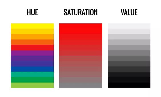
Hue contrast refers to the juxtaposition of different colors on the color wheel. Value contrast relates to the contrast between light and dark colors or tones.
Saturation contrast involves the difference between vivid and muted colors. Artists can strategically manipulate these elements to create compelling visual effects and guide the viewer’s attention within the artwork.
Utilizing color contrast to create visual impact and focal points
Color contrast is a powerful tool that enables artists to direct the viewer’s gaze, create emphasis, and establish visual hierarchy within their artwork. By employing contrasting colors, artists can draw attention to specific elements, create depth and dimension, and evoke a sense of drama or intrigue.
Psychological and Symbolic Meanings of Colors
Colors possess psychological and symbolic meanings that can greatly impact the viewer’s perception and emotional response to art. Artists leverage this understanding to evoke specific emotions, convey messages, and establish symbolic associations within their work.
Psychological Effects of Colors
Understanding the psychological effects of colors allows artists to evoke specific emotions-
- The emotional and psychological impact of colors on viewers: Colors have the power to evoke a range of emotions and psychological responses.
For example, warm colors like red can elicit feelings of passion, energy, and intensity, while cool colors such as blue can create a sense of calmness, tranquility, and serenity. Artists can intentionally use colors to influence the viewer’s mood and emotional experience.
- Common associations and perceptions of colors: Colors often carry cultural and societal associations. For instance, red can be associated with love, power, or danger, while green may represent nature, growth, or freshness.
Understanding these common associations enables artists to tap into collective perceptions and effectively communicate ideas and concepts through color.
- How artists use colors to evoke specific emotions and moods: Artists strategically employ colors to evoke specific emotional responses and set desired moods within their artwork.
By carefully selecting color palettes and utilizing color contrasts and harmonies, artists can create an atmosphere that resonates with the viewer, whether it’s a sense of joy, tranquility, excitement, or melancholy.
Symbolism of Colors
Exploring the symbolism of colors enables them to convey deeper messages and narratives-
- Cultural and symbolic meanings associated with colors: Colors carry symbolic meanings that can vary across different cultures and societies. For example, in Western cultures, white often symbolizes purity and innocence, while in some Eastern cultures, it may represent mourning.
Artists consider these cultural nuances and draw upon the symbolism associated with colors to add depth and layers of meaning to their artwork.
- Symbolic use of colors in different art movements: Throughout art history, various art movements have embraced the symbolic use of colors. For instance, the Impressionist movement utilized vibrant and contrasting colors to capture the fleeting effects of light and convey a sense of immediacy.
Symbolist artists used color to explore mystical and emotional themes, often incorporating rich and symbolic palettes in their work. Artists continue to draw inspiration from these movements and employ color symbolism to convey specific narratives and concepts.
- How artists incorporate color symbolism in their work: Artists deliberately select colors and color combinations to convey symbolic meanings within their artwork.
They may use colors to represent certain ideas, express cultural or social commentary, or create visual metaphors. By employing color symbolism, artists enrich their work and invite viewers to delve deeper into the layers of meaning embedded within the colors.
Color Mixing Techniques
Color mixing techniques are essential for artists to achieve desired hues, tones, and shades in their artwork. Whether working with traditional paint or digital tools, understanding various color mixing techniques allows artists to expand their creative possibilities and effectively manipulate colors.
Mixing Colors with Paint
Artists employ various techniques to mix colors. These techniques include layering, blending, and glazing. Layering involves applying multiple layers of paint to achieve a desired color or effect.
Blending allows artists to smoothly transition between colors, creating subtle gradients. Glazing involves applying transparent layers of color over existing layers to modify the appearance and tone.
Color Mixing in Digital Art
With the advent of digital tools and software, artists can also mix colors digitally. Digital art offers a range of possibilities and advantages for color mixing.
Artists can use blending modes and layer opacity settings to achieve smooth color transitions and unique effects.
They can also employ brushes with blending capabilities to create realistic textures and color blends. Digital tools often offer precise control over hue, saturation, and brightness, enabling artists to fine-tune colors.
Creating Mood and Atmosphere with Color
Colors have the power to set the mood and atmosphere in a work of art. Artists strategically select colors to convey specific emotions or create a particular ambiance within their pieces.
Using warm colors for energy and excitement
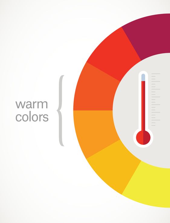
Using warm colors, such as fiery reds and glowing yellows, can infuse a painting with energy, excitement, and intensity. Warm colors are ideal for evoking passion, and urgency, or creating a vibrant and lively atmosphere.
Using cool colors for calmness and serenity
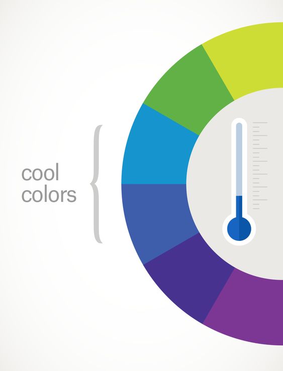
Using warm colors, such as fiery reds and glowing yellows, can infuse a painting with energy, excitement, and intensity. Warm colors are ideal for evoking passion, and urgency, or creating a vibrant and lively atmosphere.
Achieving balance with color contrast
Achieving balance through color contrast is essential in art. By juxtaposing complementary colors or utilizing contrasting hues, artists can create visual tension, add depth, and emphasize certain elements in their compositions.
Depicting emotions through color choices
Emotions can be effectively conveyed through color choices. Artists can use warm, vibrant colors to depict joy, love, or energy, while cool, muted colors can convey sadness, introspection, or a sense of mystery.
By skillfully employing colors, artists can elicit emotional responses from viewers and enhance the overall impact of their work.
Color in Different Art Styles
Different art styles employ color in unique ways, showcasing the versatility of color as an expressive tool.
Here is how color is utilized in various art movements-
- Realism: Realistic artworks strive to accurately represent the natural world. Artists use color to depict objects and scenes faithfully, capturing nuances of light, shadow, and texture.
- Impressionism: Impressionist artists focus on capturing the fleeting effects of light and atmosphere. They employ loose brushstrokes, color mixing on the canvas, and vibrant colors to create a sense of movement and luminosity.
- Cubism: Cubist artworks involve the fragmentation and abstraction of forms. Artists use color to delineate multiple viewpoints and create contrasting color planes, emphasizing the multidimensional nature of their subjects.
- Abstract Expressionism: Abstract expressionist artists prioritize emotional expression through bold and gestural brushwork. They use color intuitively, often employing vibrant hues and color fields to evoke powerful emotions and create a dynamic visual experience.
Famous Artists and Their Use of Color
Throughout art history, many renowned artists have demonstrated a deep understanding and mastery of color. Their unique approaches and use of color continue to inspire and influence artists today.
Vincent van Gogh: Expressive and Bold Color Choices
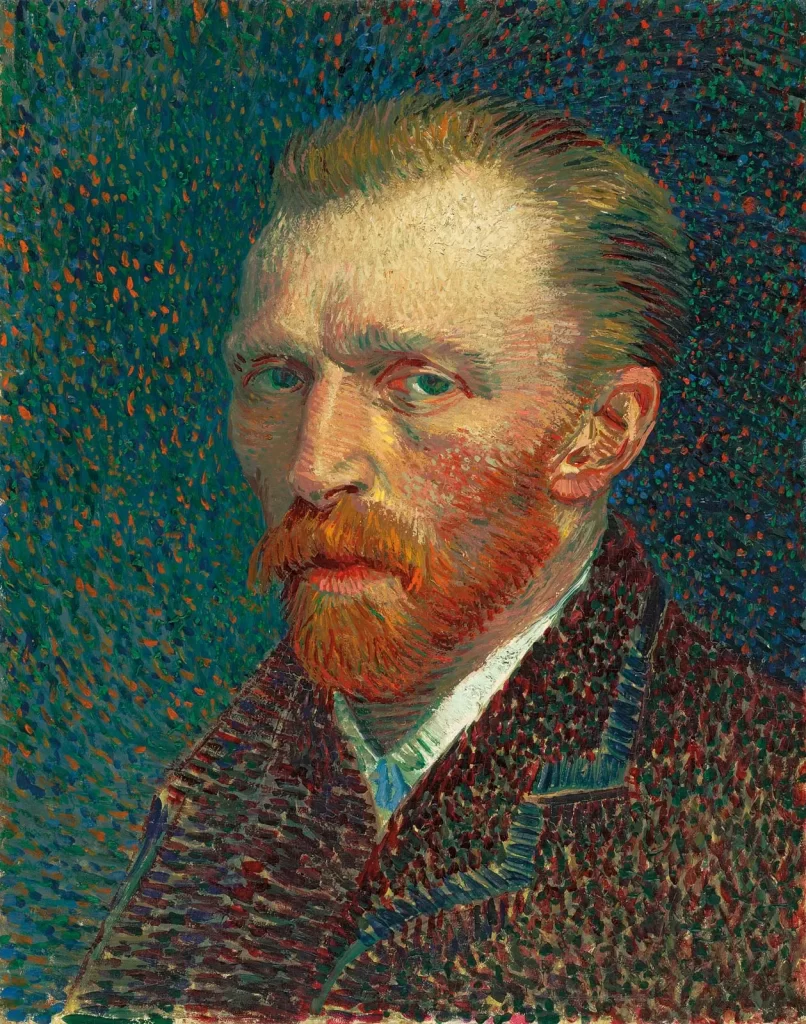
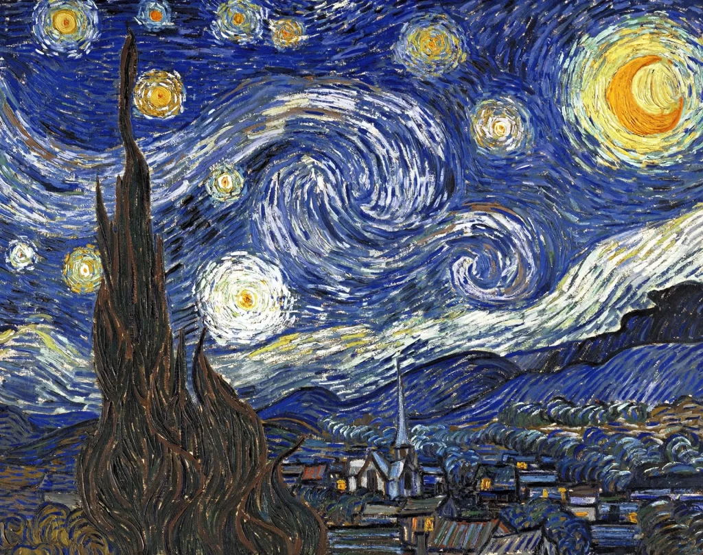
Vincent Van Gogh and his painting Starry Night
Van Gogh’s paintings are characterized by his expressive and bold use of color. He employed vibrant hues and visible brushstrokes to convey intense emotions and capture the essence of his subjects.
Van Gogh’s use of complementary colors, such as blue and orange or yellow and purple, created a dynamic contrast that heightened the emotional impact of his paintings.
Henri Matisse: Fauvism and Unconventional Colors

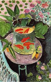
Henri Matisse and his painting Goldfish
Henri Matisse was a leading figure in the Fauvist movement, which emphasized the use of bold, non-naturalistic colors. Matisse employed vibrant and unexpected color combinations to create a sense of energy and emotion in his artwork.
His use of intense blues, greens, and reds, often in flat areas of color, challenged traditional notions of representation and perspective.
Wassily Kandinsky: Abstract Expression and Emotional Color
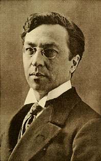
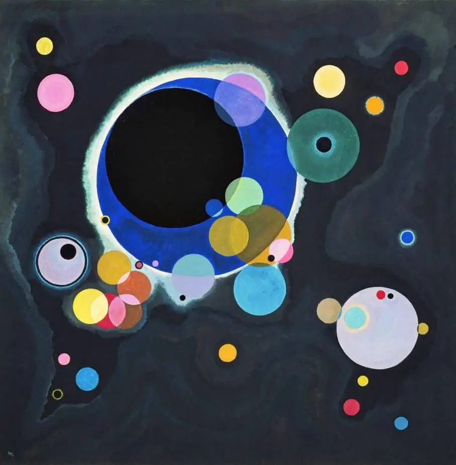
Wassily Kandinsky and his painting Several Circles
Wassily Kandinsky, a pioneer of abstract art, believed that color had a direct emotional impact on the viewer. He associated specific colors with particular emotions and spiritual states.
Kandinsky’s use of vibrant and contrasting colors, such as fiery reds and deep blues, aimed to elicit specific emotional responses from the viewer. His abstract compositions, characterized by harmonious and dynamic color relationships, sought to evoke a spiritual and transcendent experience through color alone.
Georgia O’Keeffe: Symbolic Use of Color in Nature
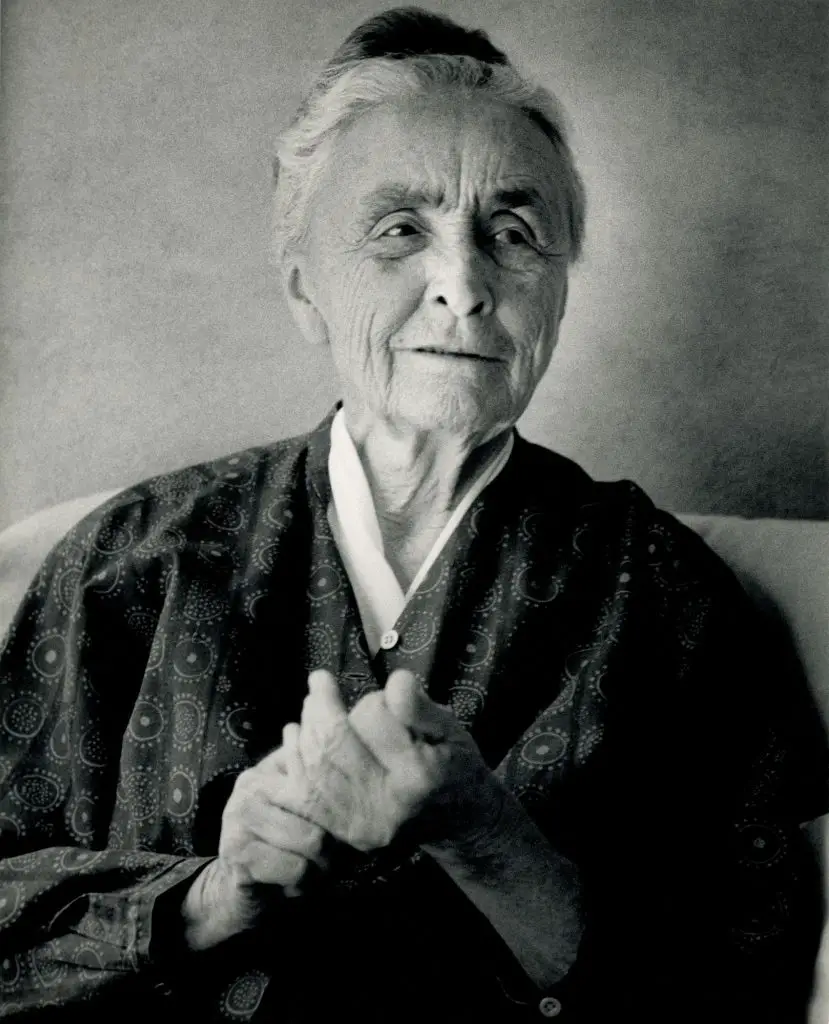
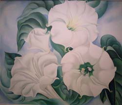
Georgia O’Keeffe is renowned for her iconic depictions of flowers and landscapes. She often used colors symbolically to convey the essence and emotional resonance of her subjects.
O’Keeffe’s bold use of vibrant colors, such as intense reds and deep purples, captured the essence and sensuality of flowers. Her unique color choices allowed her to create a connection between the viewer and the natural world, inviting contemplation and introspection.
Piet Mondrian: Geometric Abstraction and Primary Colors
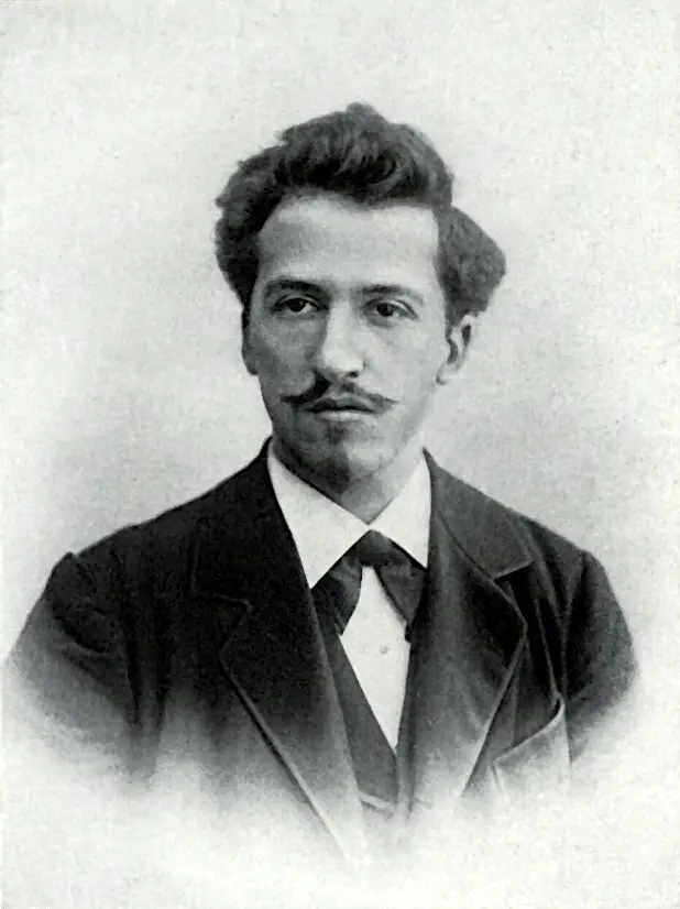

Piet Mondrian and his painting Avond (Evening): The Red Tree
Piet Mondrian is recognized for his contributions to geometric abstraction and his use of primary colors.
Mondrian believed that through the use of vertical and horizontal lines and primary colors (red, yellow, and blue), he could achieve universal harmony and spiritual balance in his artwork.
His iconic compositions of grids and color blocks, such as Composition II in Red, Blue, and Yellow, exemplify his exploration of color as a means to achieve a sense of order and balance.
FAQs
- How does lighting affect the perception of color in artwork?
Lighting plays a crucial role in the perception of color in artwork. Natural or artificial light sources can affect how colors appear, altering their hues, values, and saturations. Artists need to consider the lighting conditions under which their artwork will be viewed to ensure the intended color relationships and effects are accurately conveyed.
- What are some common mistakes to avoid when working with color in art?
Some common mistakes to avoid when working with color include using too many colors that create visual chaos, neglecting the importance of value and contrast resulting in flat compositions, and not considering the intended mood or message of the artwork when selecting colors. It’s essential to maintain a balance between experimentation and thoughtful color choices.
- Can I develop my own unique color palette or style based on color theory?
Absolutely! While color theory provides a foundation, it also encourages artists to develop their unique color palettes and styles. Artists can experiment with variations of color schemes, create their symbolic color associations, or deviate from traditional color rules to establish their distinct artistic voice and visual language. Color theory acts as a guiding tool, allowing artists to push boundaries and express their individual creativity.
- Can I break the rules of color theory in my artwork?
Certainly! While understanding color theory provides a foundation, artists have the creative freedom to break its rules and explore unconventional color choices. Artistic expression is about pushing boundaries and experimenting with new ideas. However, having a solid understanding of color theory allows artists to make informed decisions when intentionally deviating from traditional color principles.
Conclusion
Throughout this blog series, we have explored the intricacies of color theory in art, delving into the foundations of color, the significance of the color wheel, the psychology of colors, and the techniques employed by renowned artists.
We have witnessed how colors can evoke emotions, convey messages, and create harmonious compositions that captivate the eye and touch the soul.
Embrace the principles of color harmony, experiment with contrasting tones, and dare to express your emotions through the vibrant language of colors. Let your artwork speak volumes and leave a lasting impression.
So, take that brush in hand, dip it into the palette of colors, and let your imagination soar as you embark on a colorful journey of artistic excellence.
