Torn between the enigmatic allure of warm gray and the cool, calculated charm of cool gray?
When it comes to the world of design, choosing between these two shades isn’t a mere afterthought—it’s a pivotal decision that can shape the entire aesthetic of your artwork.
The age-old debate between warm gray and cool gray has left many artists in a perpetual quandary, each tone pulling at their creativity from different ends. But fear not, for in this exploration, we’re about to dive deep into the realm of warm gray vs cool gray.
Allow us to guide you through this odyssey, unveiling the secrets and unraveling the mysteries of these two gray shades.
What is Warm Gray?
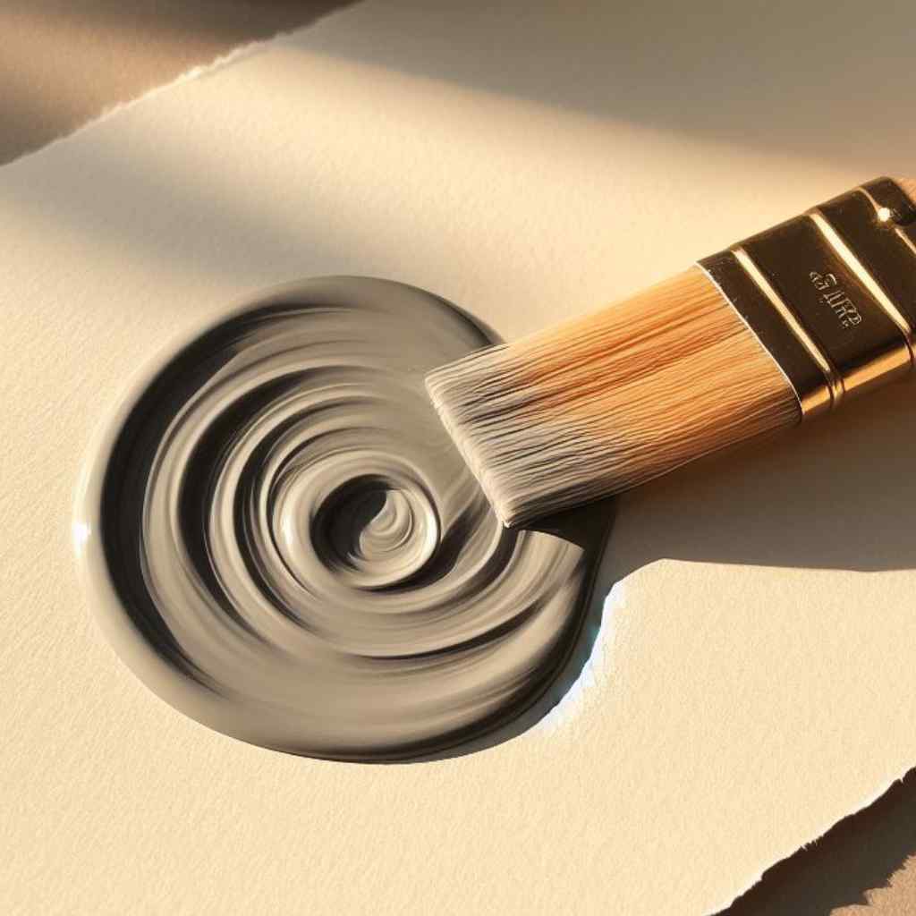
Warm gray, as the name suggests, carries undertones that lean toward the spectrum of reds, yellows, and oranges. These subtle hints imbue the gray with warmth and coziness, making it an ideal choice for creating inviting spaces.
The interplay between warm gray and natural light is a dance of warmth and radiance. Observing how this shade evolves under varying lighting conditions is key to harnessing its full potential.
Beyond aesthetics, warm gray holds a profound psychological influence on our perception of a space. It has the remarkable ability to cocoon us in comfort and evoke a sense of serenity.
Warm gray acts like a comforting embrace, enveloping a room in a soothing aura. This characteristic makes it a favored choice for spaces meant for relaxation and unwinding.
What is Cool Gray?
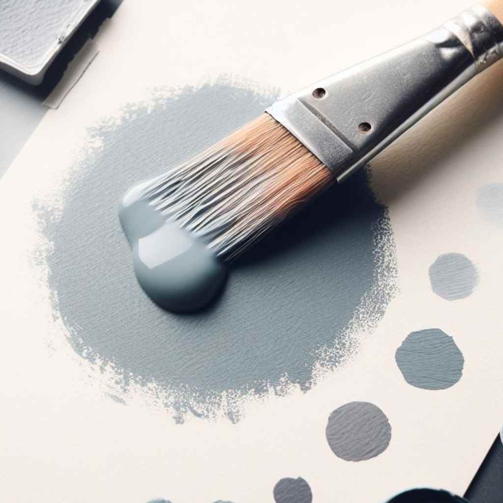
Cool gray, on the other hand, takes a departure from the blues and greens, infusing spaces with a contemporary and serene ambiance. Its crisp, clean appearance makes it a popular choice for modern designs.
Cool gray’s identity is defined by the subtle infusion of blue or green undertones. These nuances give it a distinct character that sets it apart from its warmer counterpart.
The interplay between cool gray and these cool-toned hues creates a visual experience that is both refreshing and calming.
Understanding how cool gray reacts to different lighting scenarios is crucial in harnessing its full potential. From the soft glow of natural light to the crispness of artificial illumination, these variables shape the final aesthetic.
Cool gray has a transformative effect on a space, evoking a sense of modernity and composure. It possesses the unique ability to create an environment that exudes both calmness and sophistication.
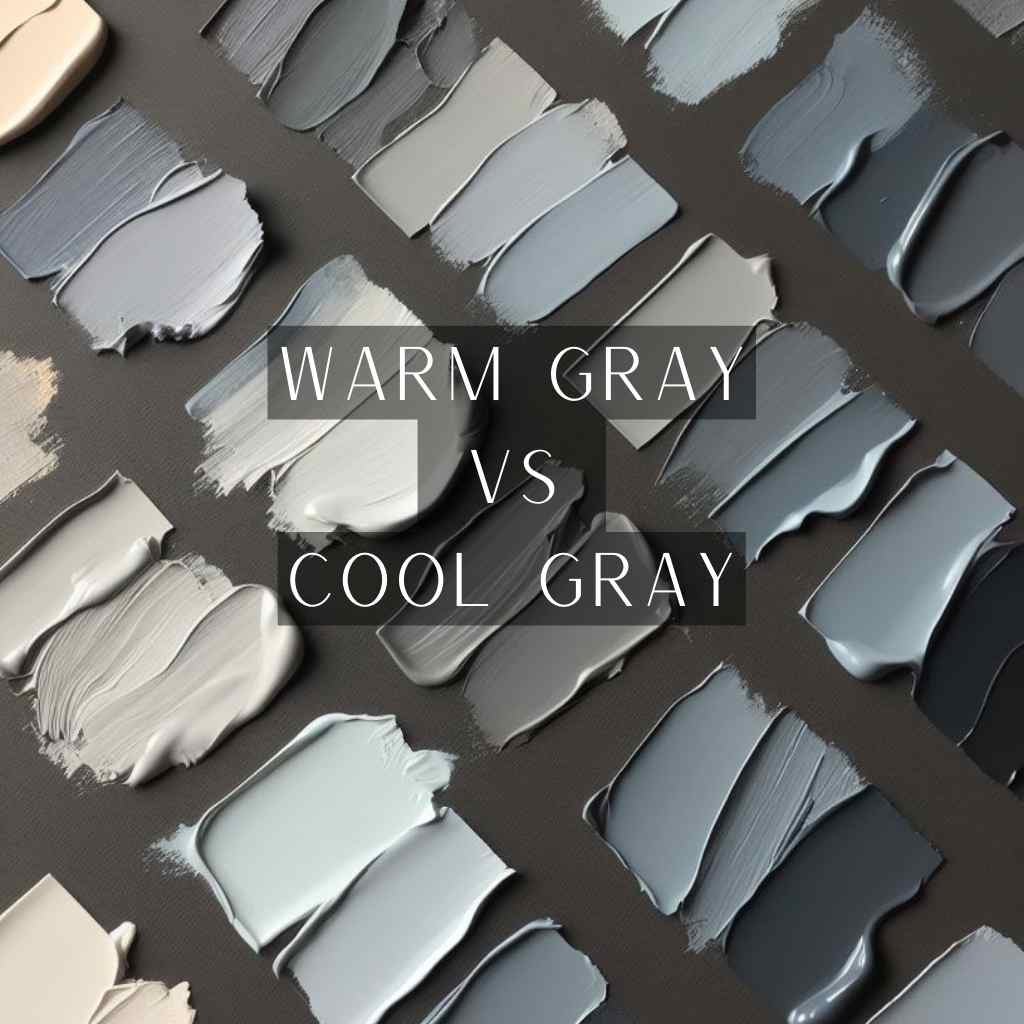
Warm Gray vs Cool Gray: Visual Comparison
As we stand at the intersection of warm and cool grays, it’s imperative to understand the visual distinctions and their compatibility with other colors.
The Visual Distinction
Warm gray, with its gentle undertones of reds, yellows, and oranges, embraces you with a sense of comfort and intimacy. It wraps spaces in a subtle, inviting aura that feels like a familiar embrace.
On the other hand, cool gray leans towards the calming shades of blues and greens, emanating a sleek, modern aura. It exudes a composed demeanor that offers a backdrop of sophistication. This direct comparison provides a tangible basis for making a nuanced choice that aligns with the desired ambiance.
Harmony with Other Colors
Warm gray’s inviting undertones harmonize effortlessly with earthy tones, crafting a palette of warmth and familiarity. When paired with shades like terracotta, ochre, or muted greens, it creates an atmosphere that feels timeless and comforting.
This combination creates a sense of balance and harmony, enriching the visual experience. It’s akin to a symphony of earthy hues that resonate with a soothing melody.
Cool gray’s cool-toned essence provides an ideal canvas for vibrant accents. When coupled with colors like aqua, teal, or bold jewel tones, it creates a dynamic visual contrast.
Against the crisp backdrop of cool gray, these brighter colors pop, infusing the space with energy and vibrancy. This interplay forms a lively and engaging environment, akin to a vibrant conversation between hues.
Transparency and Opacity
Warm gray, with its red, yellow, and orange undertones, leans towards higher transparency. When used as a glaze or wash, it interacts with underlying colors, creating depth and dimension. This adaptability makes warm gray a versatile choice in artistic applications.
Cool gray, with its blue and green hints, tends to be more opaque. It covers surfaces more thoroughly, making it ideal for creating sharp, defined lines and solid color areas. This characteristic lends a modern, precise look, particularly in graphic design and architecture.
Lightfastness and Permanence
Warm gray, with its red, yellow, and orange undertones, often contains pigments that lend it a higher degree of lightfastness. These warmer hues inherently possess properties that make them more resistant to fading.
This means that in well-lit spaces, warm gray maintains its integrity and visual impact, ensuring the design remains vibrant and enduring.
Cool gray, leaning towards blues and greens, can also demonstrate commendable lightfastness. The specific pigments used in its composition play a crucial role. Cool gray can maintain its visual integrity over time when formulated with quality pigments.
This makes it a reliable choice for environments where exposure to light is a factor.
Mixing Possibilities with Other Colors
Warm gray serves as a versatile base for mixing with a wide range of colors. Its underlying tones of reds, yellows, and oranges lend themselves well to blending with warmer hues.
Whether it’s incorporating rich browns for a cozy aesthetic or blending with subtle pastels for a soft, comforting atmosphere, warm gray proves to be a harmonious canvas that adapts to a variety of color combinations.
Cool gray, with its blue and green undertones, offers a striking contrast when mixed with other colors.
When combined with colors like aqua, teal, or even bold jewel tones, cool gray creates a visual interplay that is both lively and sophisticated.
The crispness of cool gray enhances the vibrancy of accompanying colors, resulting in a dynamic and engaging design.
Mixing warm and cool grays together or with other colors can lead to the creation of entirely new and unique hues. For example, blending warm gray with a touch of blue can yield a softened, inviting tone that bridges the gap between warm and cool.
Similarly, mixing cool gray with a hint of warmer hues can create a nuanced, balanced shade that straddles the line between modern and cozy.
Artists should experiment with different ratios by understanding color theory and layering techniques to discover the unique synergy between these two pigments.
Warm Gray and Cool Gray: Artistic Applications
When it comes to artistic endeavors, the choice between warm gray and cool gray can significantly influence the mood and impact of the piece. Let’s explore how these distinct shades can be applied to artistic creations:
- Warm Gray Invokes Comfort and Intimacy: In portraits and figurative art, warm gray adds a sense of coziness and closeness, creating a more inviting and personal connection with the subject.
- Cozy Backdrop for Still Life with Warm Gray: When used in still-life compositions, warm gray provides a warm and familiar background, enhancing the sense of comfort and nostalgia in the artwork.
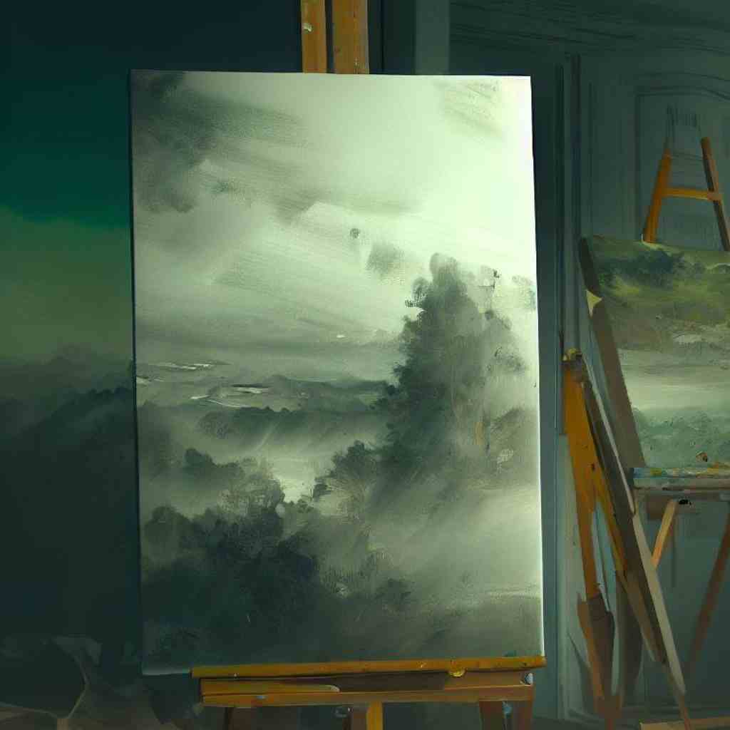
- Warm Gray’s Versatility for Landscapes: Warm gray serves as a versatile base for creating landscapes with warm, earthy tones. This adds depth and dimension to the scenery, making it feel more grounded and natural.
- Timeless and Nostalgic Warm Gray: In impressionistic and representational styles, warm gray conveys a sense of timelessness and nostalgia, giving the artwork a classic and enduring quality.
- Modern and Sleek Aesthetic Cool Gray: Cool gray is well-suited for creating a modern and sleek look, especially in architectural illustrations and urban landscapes. It imparts a contemporary and sophisticated feel to the artwork.
- Cool gray for Graphic Design: In graphic design and typography, cool gray provides a clean and crisp backdrop. This ensures that text and visuals stand out clearly and are easy to read.
- Cool Gray Evokes Calmness and Tranquility: In abstract and minimalist art forms, cool gray brings about a sense of calm and tranquility. It creates a serene atmosphere that encourages contemplation and introspection.
- Cool Gray Captures Light and Shadow: Cool Gray is adept at capturing the interplay of light and shadow, making it an excellent choice for highlighting architectural details and emphasizing form.
FAQs
- Can warm gray vs cool gray be used for underpainting techniques?
Yes, warm gray and cool gray are valuable choices for underpainting techniques in art. Warm gray imbues a sense of comfort and depth, making it ideal for figurative works. Cool gray, with its modern aesthetic, sets a calm tone and is excellent for architectural or urban-themed pieces. Both enhance the overall atmosphere of the artwork.
- How can I create a focal point using Warm Gray and Cool Gray?
Warm and cool grays can be used strategically to draw attention to specific areas in a piece of art. For example, using warm gray in the focal point can make it feel more inviting and central, while cool gray can provide contrast and guide the viewer’s eye.
- How do I use Warm Gray and Cool Gray in portrait painting?
In portrait painting, warm gray can be used to capture a sense of warmth and intimacy in the subject’s skin tones. Cool gray can be utilized for shadowing and to add a modern, refined touch to the overall composition. Balancing warm and cool grays in the portrait can result in a nuanced and lifelike representation.
- Are there specific techniques for layering Warm Gray and Cool Gray in watercolor painting?
Layering warm and cool grays in watercolor requires patience and control. Start with light washes and gradually build up layers to achieve the desired depth and tonal variations. Pay attention to drying times and experiment with different brush techniques to create subtle transitions.
Wrapping Up
As we draw near to the conclusion, our journey through the captivating realms of warm gray vs cool gray nears its end. The intricate dance between these two shades has unfurled before us, revealing a tapestry of possibilities.
Yet, our exploration has a purpose—to resolve the eternal quandary of which gray is your ideal companion in an artwork that embodies your vision.
With each stroke of insight, we’ve uncovered the nuances, dissected the psychology, and showcased their applications.
So, brace yourself for the final act, where the harmonious symphony of warm and cool gray converges into a resolute decision, ensuring your art narrative leaves an indelible mark.

