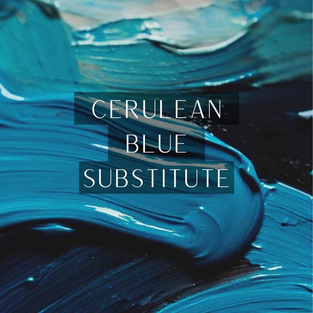
Are you an artist seeking to elevate your creative prowess to breathtaking heights?
Look no further, for we are about to unravel the captivating world of the cerulean blue substitute – an artistic gem that will revolutionize your palette and spark a symphony of colors on your canvas.
In this blog series, we delve deep into the fascinating realm of color alchemy, exploring the problem of limited choices and the agitation it brings, while presenting you with the perfect solution – a panoply of extraordinary cerulean blue substitutes.
Embrace a world where creativity knows no bounds as we unveil the secrets of these mesmerizing alternatives, elevating your artistic journey to unparalleled heights.
What is Cerulean Blue?
Cerulean Blue, also known as Cobalt Chromite Blue, is a soft and serene shade of blue with a touch of green. Its name is derived from the Latin word “caeruleus,” meaning sky-blue, and it has been a popular pigment since its discovery in the early 19th century.
Factors to Consider when Choosing a Substitute
The quest for a Cerulean Blue substitute demands careful consideration of several crucial factors-
- Lightfastness and permanence of the substitute
- Color similarity and vibrancy compared to Cerulean Blue
- Compatibility with different art materials and techniques
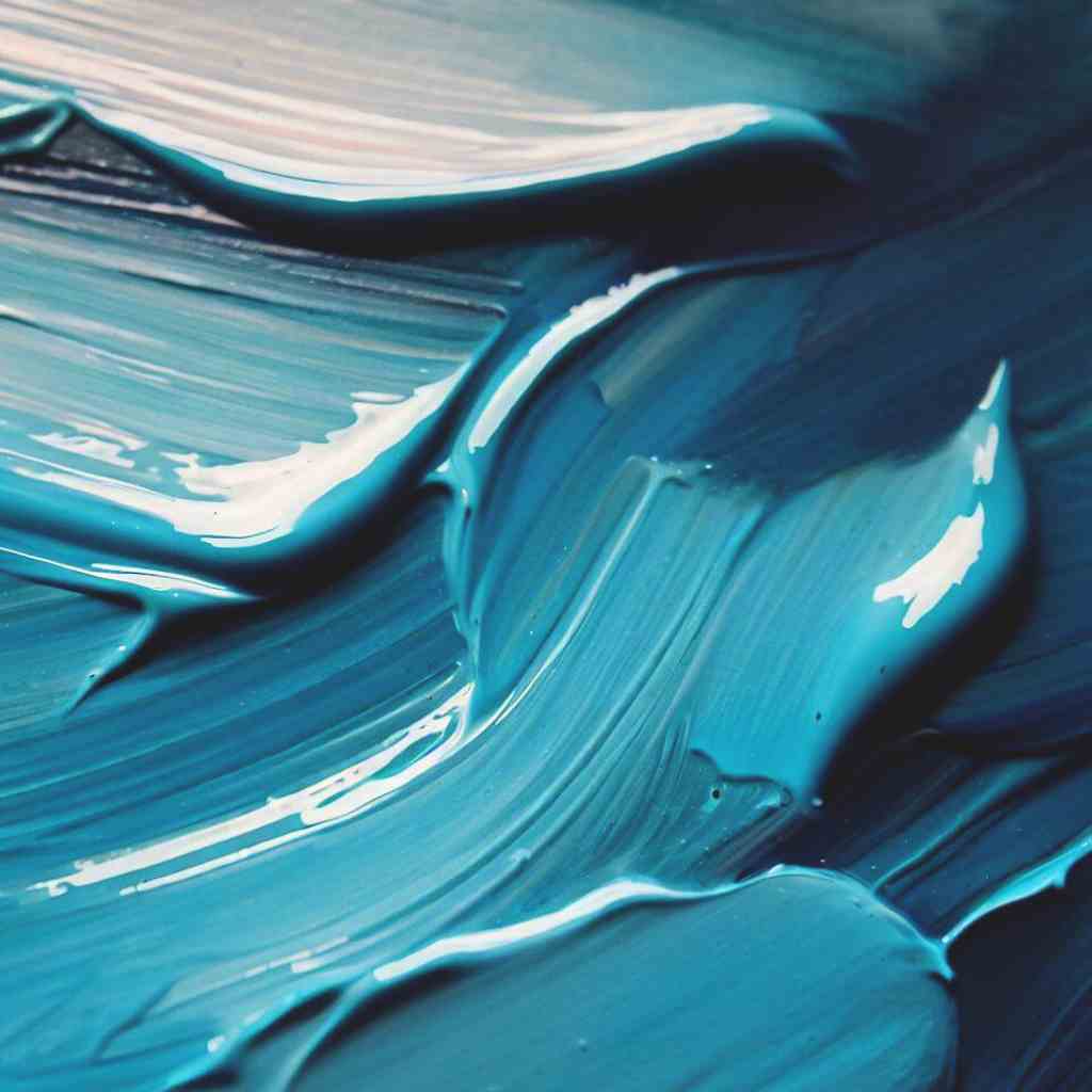
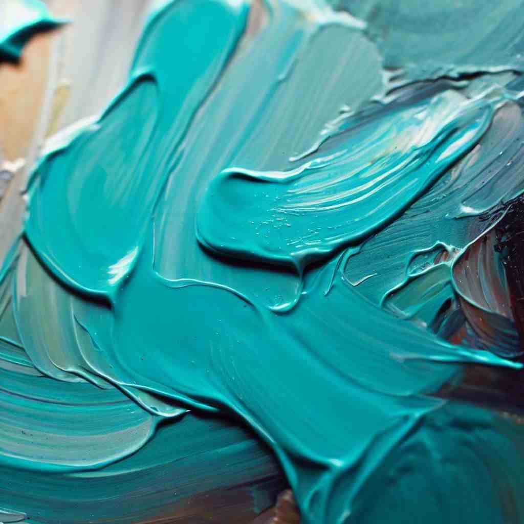
Cerulean Blue Substitute: Natural Alternatives
Nature, with its captivating palette, presents a wealth of exquisite alternatives to the beloved Cerulean Blue.
As artists seek to diversify their hues while maintaining a connection to the beauty of the natural world, these substitutes stand out as captivating choices-
Ultramarine Blue: A Deep and Versatile Option
Ultramarine Blue emerges as a rich and mesmerizing alternative, boasting deep tones that evoke a sense of mystery and depth in artworks. It captures the essence of vast, endless skies and invites viewers to immerse themselves in the artistry.
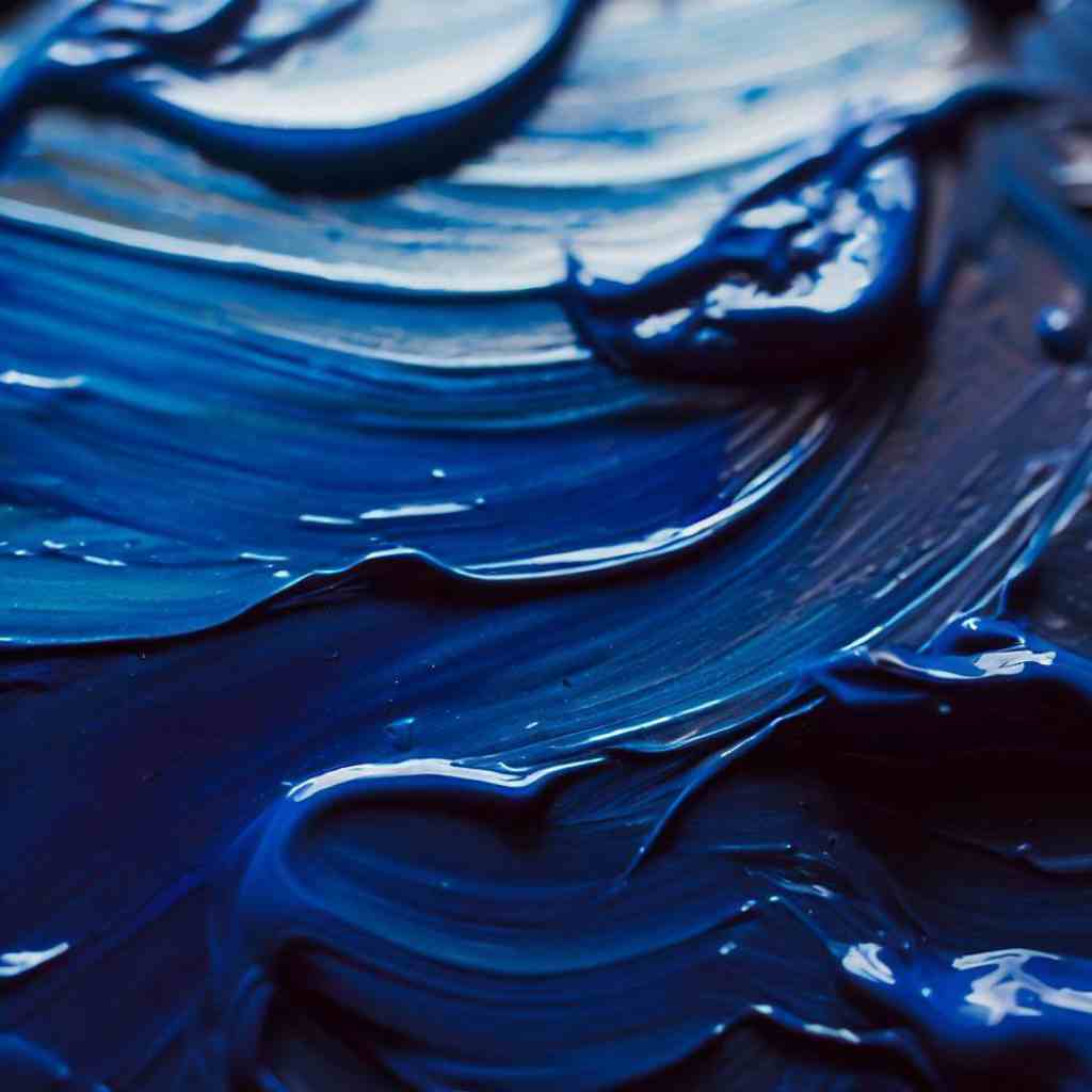
Cobalt Blue as a Viable Substitute
On the other hand, Cobalt Blue offers artists a vibrant and reliable substitute, akin to the brilliance of the clearest azure skies. Its lively demeanor breathes life into seascapes and landscapes, setting the stage for artistic exploration.
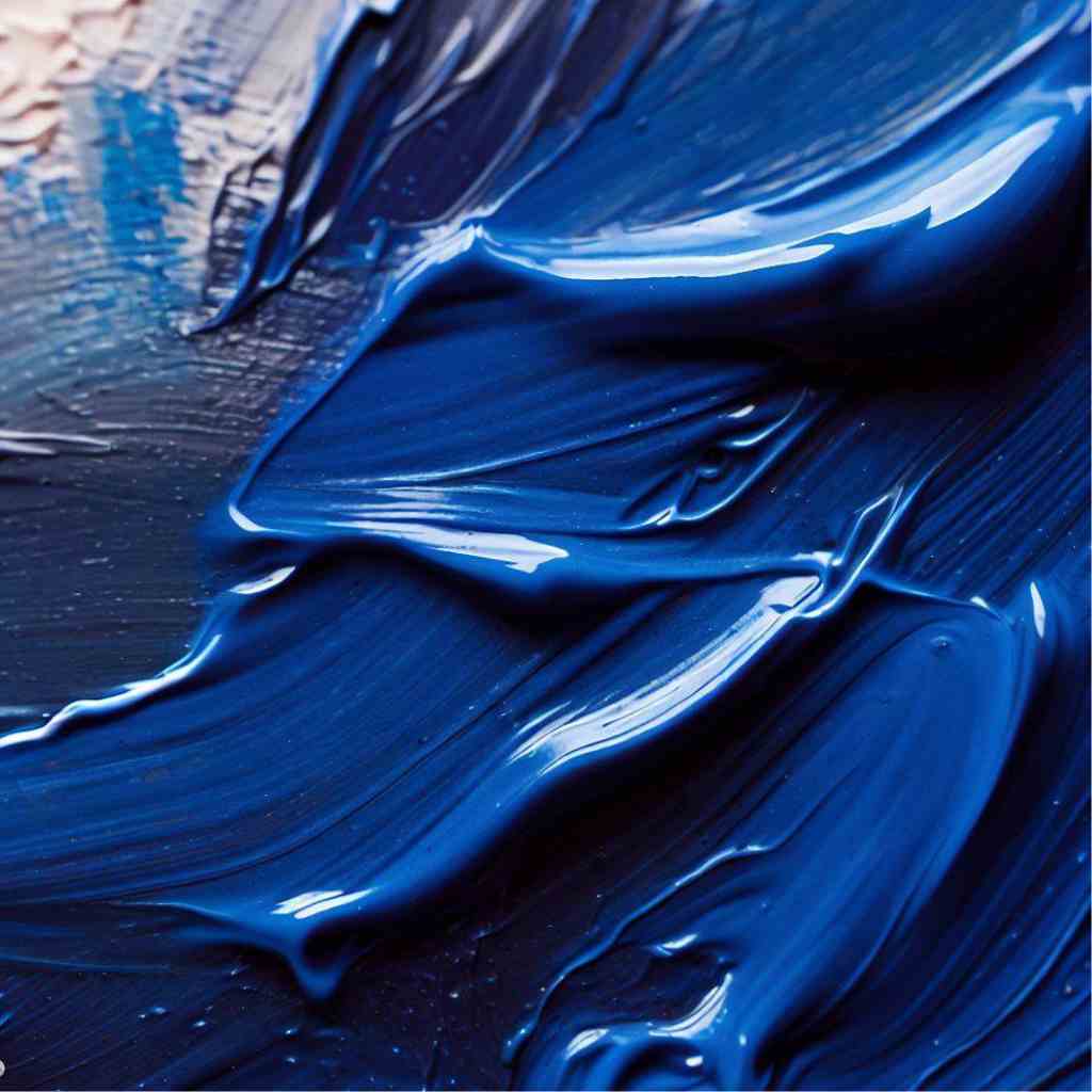
For those craving a darker, more intense alternative, Prussian Blue presents itself as an alluring choice. With its deep, velvety hues, this pigment can convey a myriad of emotions, from melancholic to powerful and dramatic.
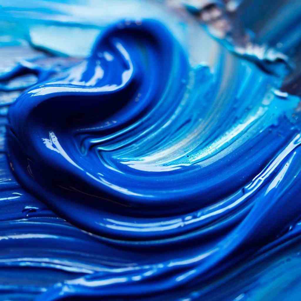
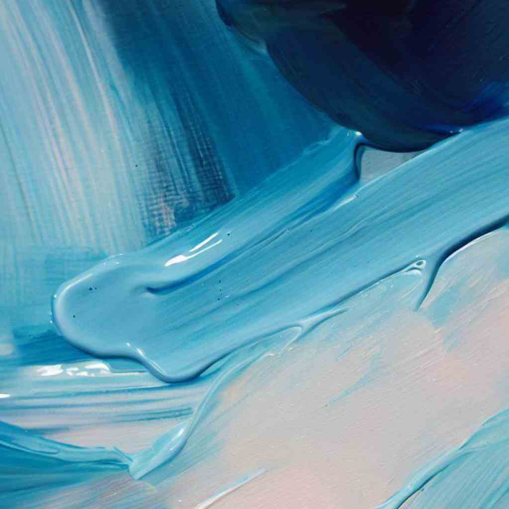
Cerulean Blue Substitute: Synthetic Alternatives
In the realm of synthetic alternatives, artists uncover a vibrant array of pigments that gracefully step into the shoes of Cerulean Blue.
These captivating substitutes not only offer rich colors but also open doors to boundless creativity-
Phthalo Blue: A Brighter Alternative
At the forefront of these alternatives is Phthalo Blue, a highly saturated and intense pigment that demands attention with its mesmerizing brilliance. Its bold presence enlivens artworks, commanding the spotlight with its captivating allure.
Manganese Blue Hue: A Synthetic Option
Manganese Blue Hue emerges as a remarkable contender, skillfully replicating the essence of Cerulean Blue. This close approximation offers artists a familiar yet unique experience, bridging the gap between tradition and innovation.
Cerulean Blue Hue: An Imitation Pigment
For those seeking a manufactured alternative that mirrors Cerulean Blue’s defining characteristics, Cerulean Hue rises to the occasion. Crafted with precision, this synthetic substitute blends seamlessly into an artist’s palette, providing a gateway to explore new artistic possibilities.
Color Theory and Pigment Mixing
To create a custom Cerulean Blue substitute that suits your artistic vision, understanding color theory and pigment mixing is essential. Colors are not isolated entities; they interact and blend with one another, resulting in an infinite array of possibilities.
Knowing how various pigments interact and learning to control these interactions will empower you to achieve your desired shade.
How to Make Cerulean Blue Substitute?
This personalized substitute will not only add uniqueness to your artwork but also grant you greater control over the colors you use in your creative journey.
By understanding color theory and following this step-by-step guide, you can confidently create your custom Cerulean Blue substitute tailored to your artistic needs.
Step-by-Step Guide to Creating a Custom Cerulean Blue Replacement
- Gather Your Pigments and a Palette: Start by selecting the primary pigments you intend to use to create your Cerulean Blue substitute. Opt for blues, greens, or greys that possess the characteristics you want in your final mix.
Select a clean and spacious suitable palette, such as glass or porcelain that allows you to mix pigments comfortably.

- Use Small Amounts: Begin with small amounts of pigments to experiment and test their interaction. This will prevent wastage and help you make adjustments as needed.
- Start with Blues: Add a blue pigment of your choice to the palette. Ultramarine Blue, Cobalt Blue, or Phthalo Blue are excellent starting points, depending on your desired shade.
- Introduce Greens or Greys: Add a green or grey pigment to the blue gradually. Observe the color shift as the pigments combine. Adjust the ratio until you achieve the desired hue.
- Explore Different Ratios: Experiment with different ratios of blue to green or grey to fine-tune your substitute. This process allows you to customize the intensity and temperature of the color.
- Test for Transparency: Test the transparency of your substitute by layering it over white paper. Transparent substitutes can offer interesting layering effects in your artwork.
- Observe Dry and Wet States: Allow your mix to dry and compare its appearance in both dry and wet states. Some pigments may appear different once dry, so it’s crucial to consider both.
- Compare to Cerulean Blue: Hold your substitute next to a genuine Cerulean Blue sample to compare the two colors. While your substitute may not be an exact match, it should capture the essence of Cerulean Blue.
- Adjust and Refine: If needed, make adjustments and refinements to your substitute to achieve the desired shade. Remember, the process of mixing pigments is an art in itself, and experimentation is key.
Document Your Process and Store Your Custom Mix
Take notes on the pigments and ratios you used during the mixing process. This documentation will help you recreate the same substitute in the future if needed.
Once you’re satisfied with your Cerulean Blue substitute, store it in a well-labeled airtight container to preserve its freshness and consistency.
Experimenting with Unique Substitutes
The world of art opens up to endless possibilities as artists embark on an exploratory path, venturing into the realm of unique substitutes for Cerulean Blue.
These captivating alternatives, distinct in their own right, invite artists to break free from convention and embrace a new creative language.
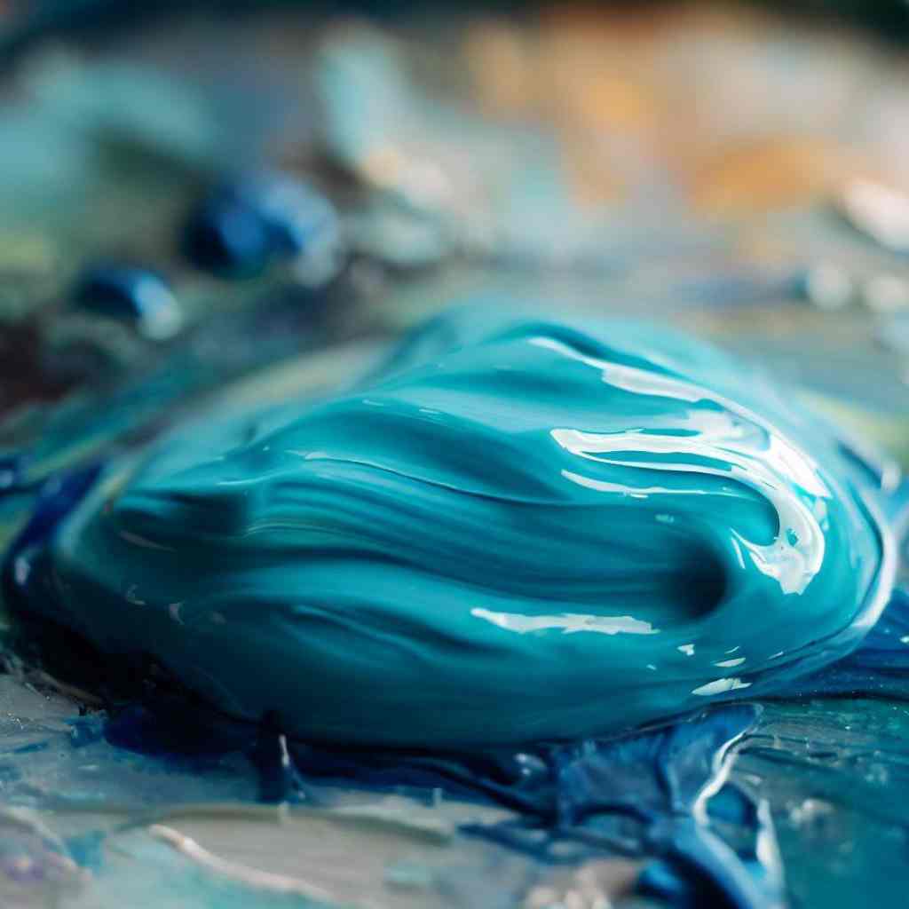
Viridian: A cool green option with a touch of blue
Viridian emerges as a cool green option with a touch of blue, enchanting the artistic eye with its ethereal charm.
Its cool demeanor infuses artworks with a sense of tranquility, while the subtle touch of blue introduces an element of serenity, reminiscent of gentle streams flowing through lush landscapes.
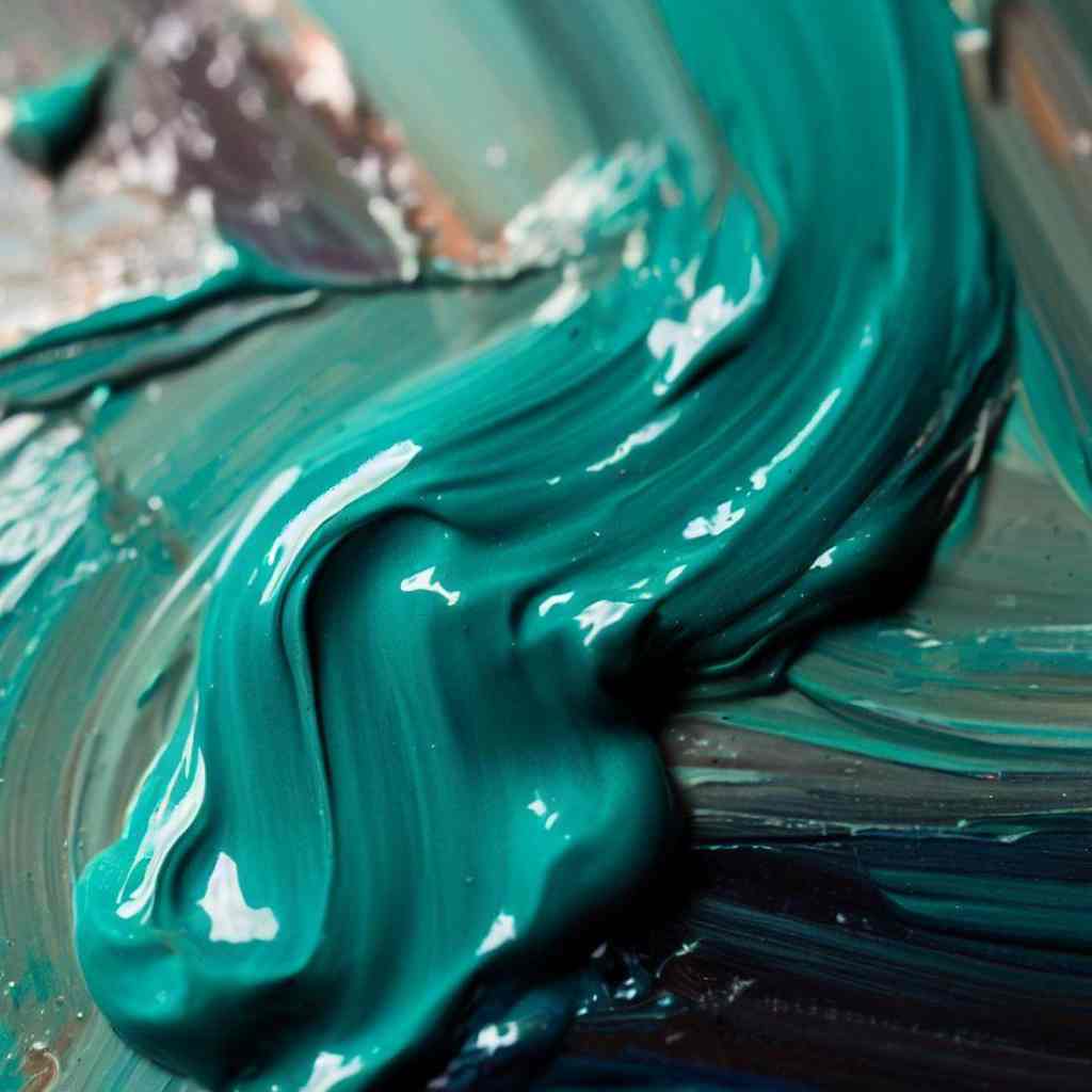
Turquoise: A vibrant and tropical alternative
For those seeking a substitute that mirrors the vibrant allure of tropical waters, Turquoise presents itself as a vibrant and captivating choice.
With its vivid character, this alternative injects energy and liveliness into art pieces, evoking the feeling of sun-kissed shores and vibrant coral reefs.
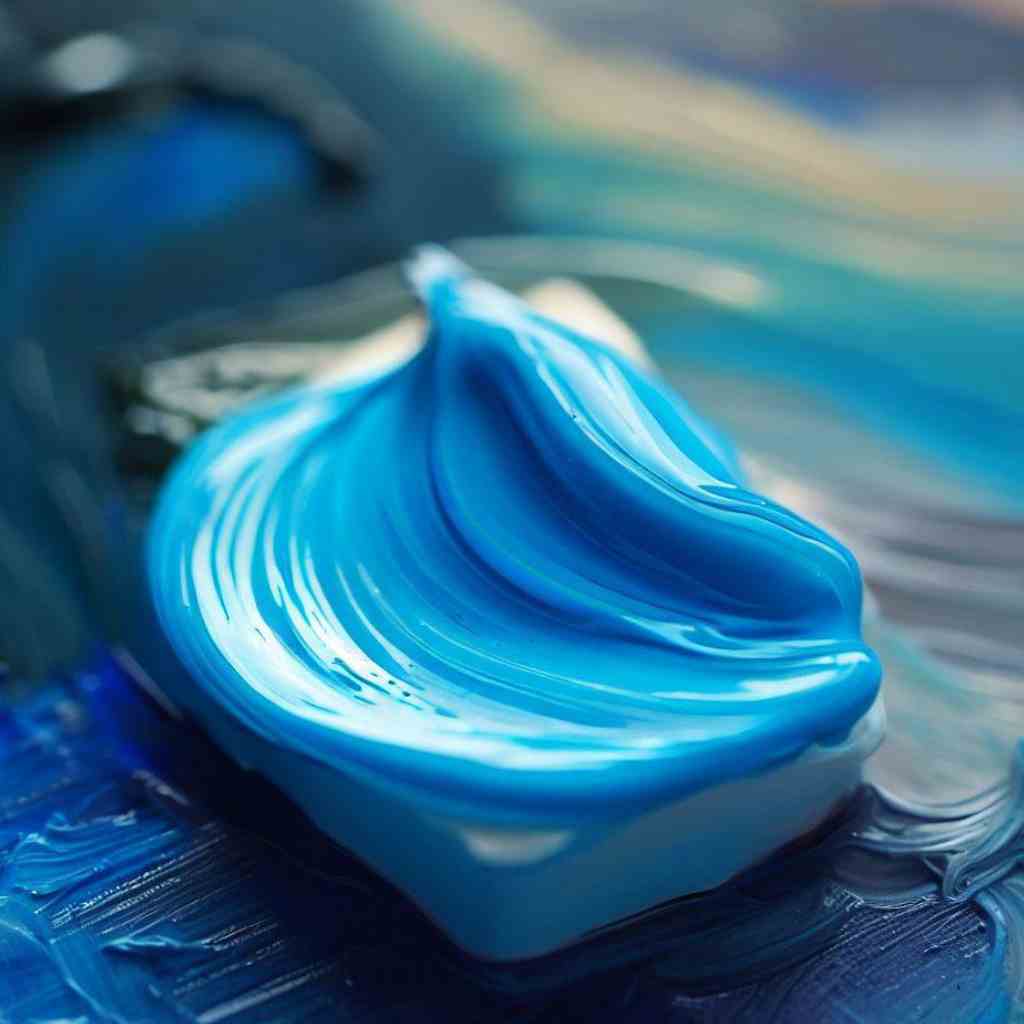
Sky Blue: A light and airy substitute
Sky Blue embraces a light and airy presence on the other end of the spectrum, bestowing a sense of boundless freedom and endless horizons. This substitute paints a vivid picture of clear skies and open spaces, inspiring artists to explore the vast expanse of creativity.
Artists’ Insights and Recommendations
Whether you work with watercolors, acrylics, or oils, these tips and tricks will empower you to integrate substitute pigments seamlessly into your artistry-
Preferred Cerulean Blue Substitutes in Different Art Styles
- Watercolor Artists Speak: Watercolor artists often prefer Cobalt Blue as a top substitute for Cerulean Blue due to its similar cool and transparent qualities.
It’s delicate washes and subtle blending make it an ideal choice for capturing the essence of Cerulean Blue in watercolor paintings.
- Acrylic Artists’ Choices: Acrylic painters, on the other hand, often opt for Phthalo Blue as their go-to substitute. Its vibrant and intense hue adds a striking element to acrylic artworks, allowing artists to create powerful visuals while exploring various textural techniques.
- Oil Painters’ Recommendations: Oil painters find Ultramarine Blue to be an excellent Cerulean Blue alternative. Its warm undertones lend a unique dimension to oil paintings, especially in landscapes and seascapes, where it can capture the depth and intricacies of the natural world.
Tips and Tricks for Successfully Incorporating Substitute Pigments
- Gradual Integration: One of the key tips shared by artists is to gradually incorporate substitute pigments into your palette. Begin by using them in smaller portions alongside familiar colors.
This gradual integration allows you to become familiar with their characteristics and behavior, leading to more successful results.
- Experiment with Mixing: Don’t be afraid to experiment with mixing your substitute pigments with other colors on your palette. Artistic innovation often arises from daring color combinations, and you may stumble upon captivating effects that set your artwork apart.
- Layering for Depth: Artists emphasize the importance of layering substitute pigments to achieve depth and luminosity in their paintings. Layering allows for more complex and nuanced shades, enhancing the visual appeal of your artwork.
- Balance with Complementary Colors: Balance the use of substitute pigments with complementary colors to create harmonious compositions.
Complementary colors add contrast and balance to your artwork, ensuring that your substitute pigments blend seamlessly with other hues on your palette.
- Utilize Tinting Strength: Take advantage of the tinting strength of your substitute pigments. Some pigments have stronger tinting abilities, which means a little goes a long way. Utilize this feature to create subtle variations and highlights in your artwork.
- Observe and Learn: Observe the work of other artists who have successfully incorporated substitute pigments into their creations. Analyze their techniques and study how they blend, layer, and combine colors to achieve their desired effects.
- Practice and Patience: As with any new artistic venture, practice and patience are key. Be open to embracing the unexpected and learning from your experiments. Over time, you will develop a deeper understanding of your substitute pigments and how to best utilize them in your art.
FAQS
- Do substitutes offer the same level of lightfastness as traditional Cerulean Blue?
The lightfastness of substitutes varies depending on the specific pigment and brand. It’s essential to check product labels and reviews to ensure the chosen substitute meets your requirements.
- Can I achieve the same level of transparency with substitutes as with Cerulean Blue?
The transparency of substitutes may not always perfectly mirror Cerulean Blue, but certain alternatives do offer comparable levels. Artists can achieve delicate layering effects and luminous applications by selecting substitutes with suitable transparency. Factors such as pigment type and quality influence the level of transparency, so it’s essential to experiment and explore various options. While some substitutes may exhibit slightly different characteristics, their versatility and vibrant hues make them exceptional choices for artists seeking captivating results in their artwork.
- How can I enhance the vibrancy of substitutes in my artwork?
To enhance the vibrancy of substitutes in your artwork, consider using white or light-colored underpaintings or grounds. These create a luminous base, allowing the substitutes to shine with brilliance. Additionally, utilizing glazing techniques can intensify the colors and add depth to your artwork. Experiment with various mediums and additives like flow improvers to improve the performance and vividness of substitutes.
Wrapping Up
As we draw the final brushstroke on this captivating artistic journey, it’s time to reflect on the vibrant world of the cerulean blue substitute and the boundless creativity it unveils.
Throughout this blog series, we’ve explored the problem of limited color choices and the agitation it can bring to artists seeking new dimensions in their art.
But fear not, for we’ve presented the perfect solution – a palette of extraordinary cerulean blue substitutes that beckon artists to break free from conventions and embrace uncharted artistic territories.
Embrace the vibrancy of these substitutes and let your artistry soar to unforeseen heights. Let your creativity be the beacon that guides others to explore the mesmerizing realm of colors beyond imagination.
You are absolutely right. In it something is also idea excellent, agree with you.
It agree, very good information
It is remarkable, rather valuable piece