Torn between the subtle allure of warm gray and the timeless elegance of beige? It’s a problem many artists face when seeking that perfect hue to breathe life into their creations.
We’re about to unravel the mysteries of warm gray vs beige, peeling back the layers to reveal their essence, their impact, and their unique place in the artist’s palette.
Buckle up, because this journey promises to be both illuminating and inspiring, as we explore the depths of these nuanced tones and equip you with the knowledge to wield them with mastery and finesse.
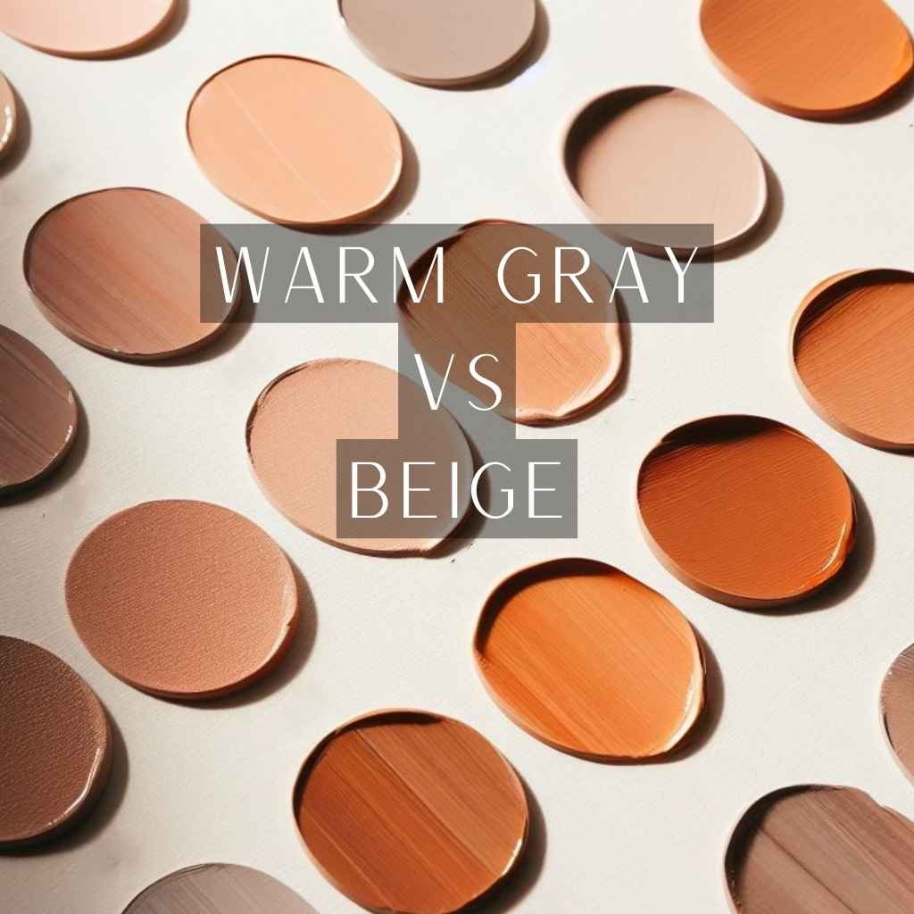
What is Warm Gray?
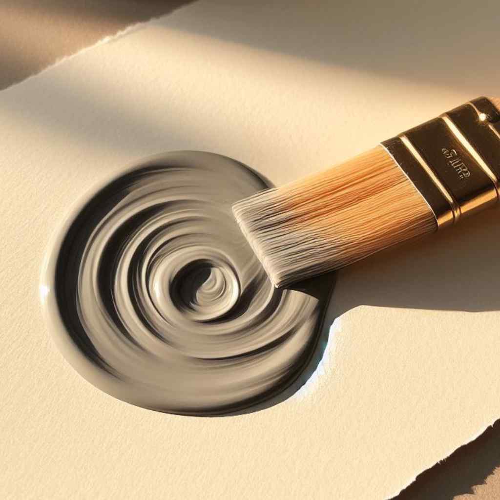
Warm Gray’s magic lies in its subtle undertones, ranging from the whisper of a rosy blush to the rich embrace of earthy browns. These undertones influence the mood it imparts to a composition.
From creating depth to accentuating contrasts, Warm Gray proves to be a versatile choice for artists across diverse styles and genres. Its adaptability allows it to integrate into various artistic visions seamlessly.
What is Beige?
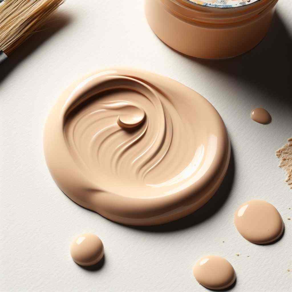
Beige, a seemingly modest hue, carries with it a rich tapestry of origins and cultural symbolism. Its understated elegance has made it a staple in art across various historical movements.
Derived from the French word for natural wool, ‘beige’ pays homage to its organic roots. This earth-inspired hue reflects the soothing tones of sand, stone, and sunlit landscapes.
Beige, often associated with simplicity and purity, serves as a canvas for other colors to harmonize upon. It embodies a sense of unpretentious grace that resonates across cultures.
Warm Gray vs Beige: Comparative Analysis
The choice between Warm Gray and Beige extends beyond personal preference, finding resonance in various art styles and genres-
Tonal Differences
Warm Gray, with its subtle infusion of red and brown undertones, introduces a touch of warmth to the grayscale spectrum. Warm Gray’s composed sophistication imparts a sense of refinement to a composition.
Beige, on the other hand, embodies a softer, more muted warmth, marrying gray and brown with delicate finesse. Beige’s unassuming elegance fosters a feeling of approachability.
Transparency and Opacity
Warm Gray and Beige can be used in varying degrees of transparency or opacity to achieve different effects in an artwork.
For instance, using Warm Gray in a transparent wash can create subtle tonal variations and allow underlying layers to show through, while applying it in an opaque manner can create solid forms.
Beige, with its muted and earthy tones, can also be applied in transparent washes for a soft, layered effect, or in a more opaque manner for defining shapes and areas.
Lightfastness and Longevity
The lightfastness and longevity of Warm Gray and Beige in art materials can vary depending on the specific pigments and the quality of the products used.
Generally, warm gray tones, being often composed of various pigments, may have differing degrees of lightfastness. High-quality artist-grade materials tend to have better lightfastness, ensuring that the artwork retains its original colors over time.
Beige, as a neutral hue, is less prone to fading, but again, its lightfastness can depend on the specific pigments used. It’s advisable for artists to invest in professional-grade materials to enhance the longevity of their creations.
Mixing and Blending Possibilities
Warm Gray, with its range of undertones, can be blended to achieve various levels of warmth or coolness, allowing for precise tonal adjustments. When mixed with other colors, it harmonizes beautifully, creating subtle transitions and gradients.
Beige, known for its neutrality, serves as an excellent base for blending warm and cool tones, imparting a gentle warmth or coolness to the resulting shades. This versatility empowers artists to create intricate nuances and gradients, enriching their compositions with depth and dimension.
Artists should experiment with different ratios with different colors by understanding color theory and layering techniques to discover the unique synergy between these two pigments.
Balancing Warm Gray with Beige
Balancing Warm Gray with Beige allows for a seamless transition between elements, creating a cohesive and visually engaging composition. Their combined subtlety forms a foundation for other colors to dance upon.
Strategically placing Warm Gray and Beige can draw the eye to specific focal points within a composition. Their understated elegance guides the viewer’s gaze, highlighting areas of significance.
Warm Gray and Beige: Artistic Application
The artful integration of Warm Gray and Beige opens the door to a symphony of visual possibilities-
- Mood Elevation with Warm Gray: This warm-toned gray possesses the unique ability to elevate moods, instilling a sense of comfort and serenity in the viewer. It provides a visual sanctuary, inviting observers to bask in its gentle embrace.
- Beige Setting the Tone: As a base, Beige establishes the mood and atmosphere of a composition. Its understated presence allows other colors to shine, while still imparting a distinct character.
- Warm Gray Creating Depth and Contrast: In monochrome compositions, Warm Gray’s nuanced tonality allows for the subtle delineation of form. It delicately balances light and shadow, infusing depth into the artwork.
- Beige Evoking Calmness and Serenity: In the background, Beige offers a serene canvas upon which other elements can unfold. It exudes a sense of tranquility, inviting the viewer into a peaceful contemplation of the artwork.
- Portraying Realism with Warm Gray: Warm Gray, with its ability to mimic the subtle variations of natural light, lends a realistic touch to portraits and still life, capturing the intricacies of form and texture.
- Achieving Timelessness with Beige: Beige’s enduring quality evokes a timeless aesthetic. It transcends trends, offering a classic backdrop that allows the subject matter to take center stage.
Final Thoughts
Through our exploration, we’ve delved into the intricacies of these nuanced tones, uncovering their emotional resonance and applications in various artistic styles.
It’s evident that warm gray imparts a sense of refinement, evoking tranquility and warmth, while beige offers a neutral backdrop, exuding an unassuming elegance. The key lies in understanding their individual strengths and harnessing them to amplify your artistic vision.
So, whether you’re striving for subdued sophistication or a touch of timeless grace, remember the power of warm gray vs beige lies in your hands, waiting to breathe life into your next masterpiece.