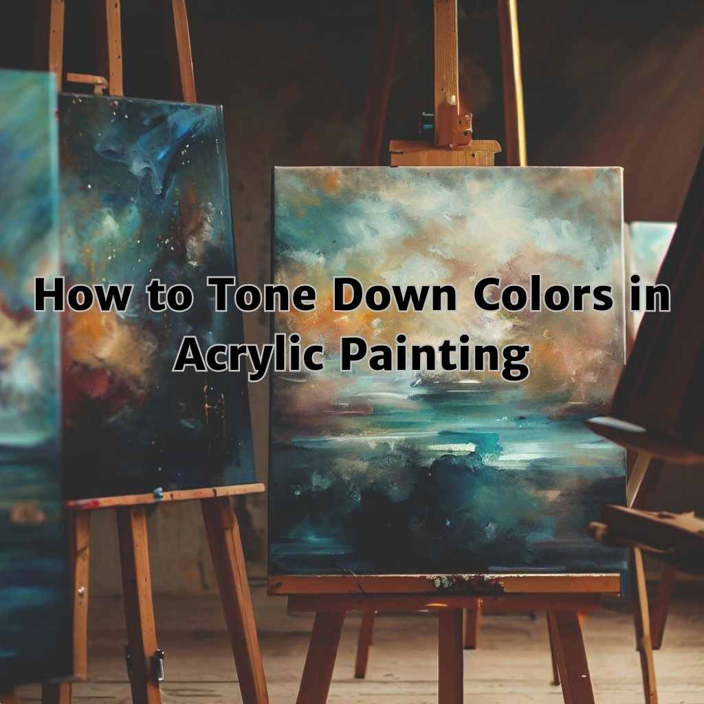
Are your acrylic paintings lacking depth and harmony? Do you find yourself struggling to achieve the right balance of colors? If so, you’ve come to the right place.
In this captivating introduction, we will dive into the fascinating world of how to tone down colors in acrylic painting. Get ready to unleash your creativity and take your artwork to the next level.
Whether you’re a seasoned artist or just starting out, understanding the importance of color balance is crucial. From the impact of color saturation to the principles of color theory, we will explore the basic concepts that lay the foundation for toning down colors in your acrylic paintings.
So, grab your brushes and palette knives, and let’s embark on an artistic journey that will revolutionize your approach to painting.
Color Intensity
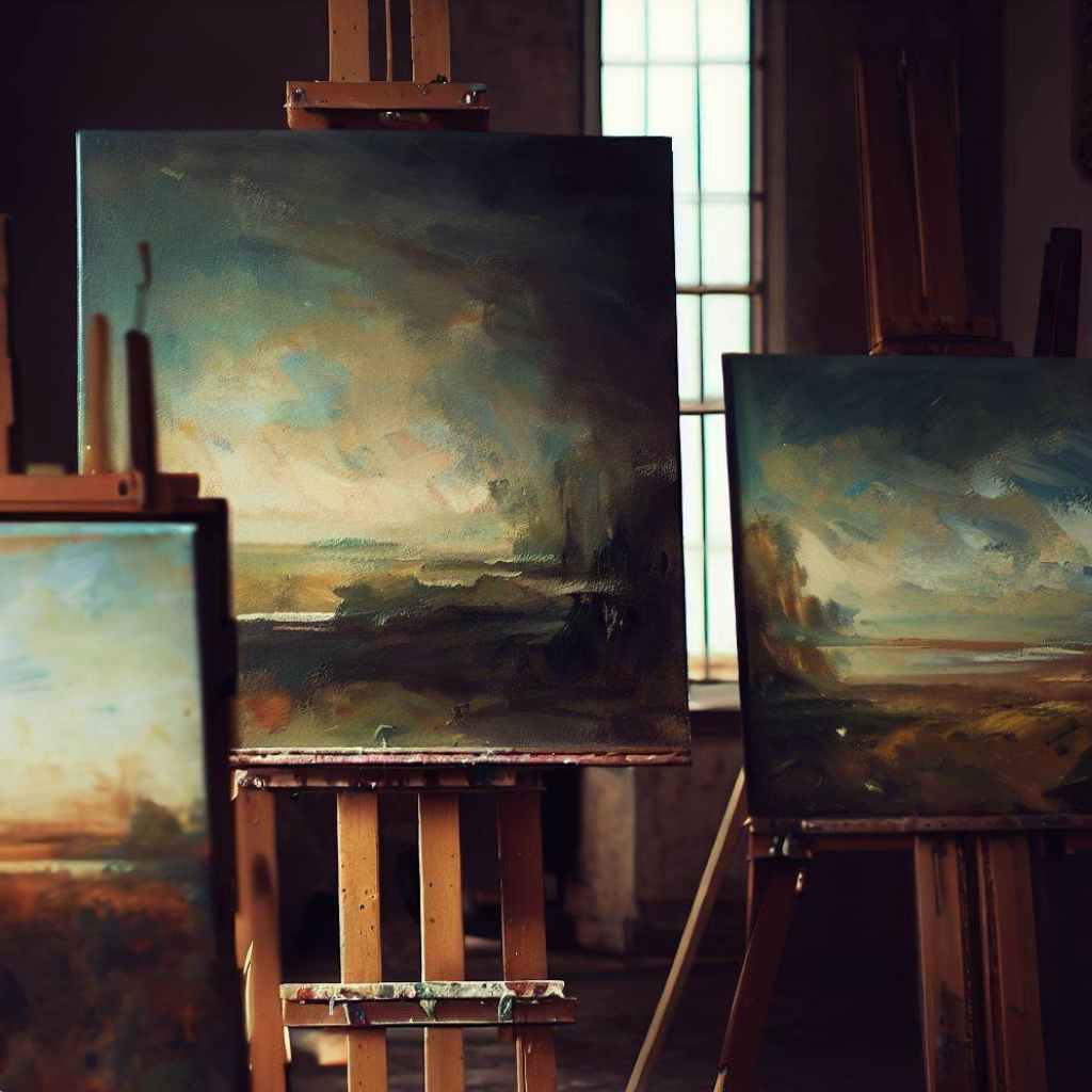
Color intensity refers to the brightness and vibrancy of color. It is essential to understand the impact of high color intensity on a painting. Bold and vibrant colors can sometimes overpower the composition and distract the viewer from the intended focal points.
The concept of toning down colors
Toning down colors involves reducing the intensity of color to achieve a more balanced and subtle effect. Acrylic painting utilizes primary, secondary, and tertiary colors, which can be combined to create a wide spectrum of hues.
A color wheel is a valuable tool that helps artists identify complementary and analogous color schemes. By toning down certain colors, you can create a harmonious color palette that allows for better control of the overall composition.
How to Tone Down Colors in Acrylic Painting: Techniques
Color saturation affects the overall visual experience of a painting. By toning down colors, we can create a sense of balance and harmony, preventing certain colors from overpowering the composition.
Here are some techniques for toning down colors-
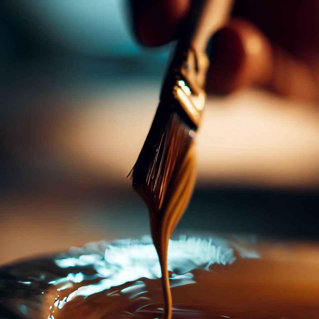
Glazing Techniques
Glazing is a technique in acrylic painting that involves applying thin layers of transparent or semi-transparent paints over existing colors. It is used to subtly tone down vibrant hues and create depth in artwork.
Follow these steps to glaze for toning down colors:
- Select the transparent or semi-transparent paints that closely match the hues you wish to tone down.
- Prepare the glaze by mixing a small amount of paint with a glazing medium or a transparent binder. This mixture will create a more fluid consistency that is suitable for glazing.
- Start with a fully dried base layer of paint. This layer serves as the foundation for your glazes.
- Dip your brush into the glaze mixture, making sure to remove any excess paint to avoid overpowering the base layer.
- Using light and even strokes, apply the glaze over the desired areas. Keep in mind that glazes are translucent, so multiple layers may be necessary to achieve the desired tonal effect. Allow each layer to dry before applying the next one.
Dry Brushing
Dry brushing is a painting technique that involves using a brush with minimal paint to create a textured and nuanced effect. It can be a valuable method for achieving subtle color adjustments in your artwork.
Here’s how to achieve subtle color adjustments through dry brushing:
- Use a brush that has only a small amount of paint on its bristles.
- Apply light pressure with the brush to create a thin layer of paint on the surface, resulting in a subtle color adjustment.
- Start with a light application of paint and gradually build up the desired effect by modifying the existing colors, adding depth, highlights, or shadows.
- To seamlessly integrate the dry-brushed areas with the rest of your painting, gently blend and soften the edges of the dry-brushed sections.
- Use brushes with stiff bristles, such as hog hair or bristle brushes to create a drier application.
Scumbling
Scumbling involves applying a thin layer of opaque or semi-opaque paint over an existing color. This layer partially covers the underlying color, allowing it to show through and creating a soft, diffused effect. Scumbling can help tone down overly vibrant colors and add a sense of depth to your artwork.
Here’s how to scumble to soften and mute vibrant colors:
- Select brushes with soft bristles like flat or filbert brushes that allow for controlled blending and smooth application. Choose complementary colors or muted tones that are slightly lighter or darker than the colors you wish to tone down.
- Instead of applying thick layers of paint, opt for thin and translucent layers. This allows the underlying colors to peek through, creating a softer and more subdued appearance.
- Identify the vibrant colors that you want to tone down and apply the scumbling technique to those areas. This helps create focal points and adds depth to your painting.
- Blend the scumbled layers with the existing colors on the canvas using gentle and gradual strokes.
Blending Techniques
Blending techniques in acrylic painting allow you to achieve smooth transitions and tonal variations in your artwork.
Here are some blending techniques to help you tone down colors effectively:
- Wet-on-Wet Blending for Toning Down Colors:
Wet-on-wet blending involves applying wet paint onto a wet surface. This technique allows the colors to mix and blend seamlessly, creating smooth transitions and tonal adjustments.
To achieve this, apply a base color and while it is still wet, add the desired color next to it. Blend the two colors gently using a brush or palette knife, softening any harsh edges.
- Layering and Feathering Techniques for Gradual Color Transitions:
Layering involves building up multiple thin layers of paint to achieve depth and gradual color transitions.
Apply a base layer, let it dry, and then add subsequent layers with slightly lighter or darker tones.
Feathering is the technique of using soft, feathery strokes to blend colors together, creating subtle transitions. Experiment with layering and feathering to achieve the desired tonal effects.
- Achieving Smooth Blends with Brush and Palette Knife:
Both brushes and palette knives can be used to achieve smooth blends. Brushes are excellent for creating softer transitions, while palette knives can add texture and create bolder, more distinct blends.
Experiment with different brush sizes and shapes, as well as various palette knife techniques, such as scraping or swirling, to achieve the desired blend and tonal adjustments.
Underpainting
Underpainting involves applying a base layer of color to establish the overall tonal values and mood of your artwork.
By using muted or complementary colors for the underpainting, you can effectively tone down the vibrancy of subsequent layers. The underpainting acts as a base for your subsequent layers of paint, allowing you to build upon it and create depth.
Step-by-Step Guide to Creating an Underpainting:
- Start with a fully dried canvas or surface.
- Choose a color that complements the overall tone or mood you want to achieve.
- Dilute the paint with water or medium to create a transparent or semi-transparent layer.
- Apply the underpainting color evenly across the surface, using broad strokes or a wash technique.
- Allow the underpainting to dry completely before adding subsequent layers of paint.
Incorporating Underpainting Techniques for Different Subjects:
Underpainting techniques can be applied to various subjects and styles of acrylic painting.

For portraits, consider using a grayscale underpainting to establish values and create a solid foundation for skin tones.
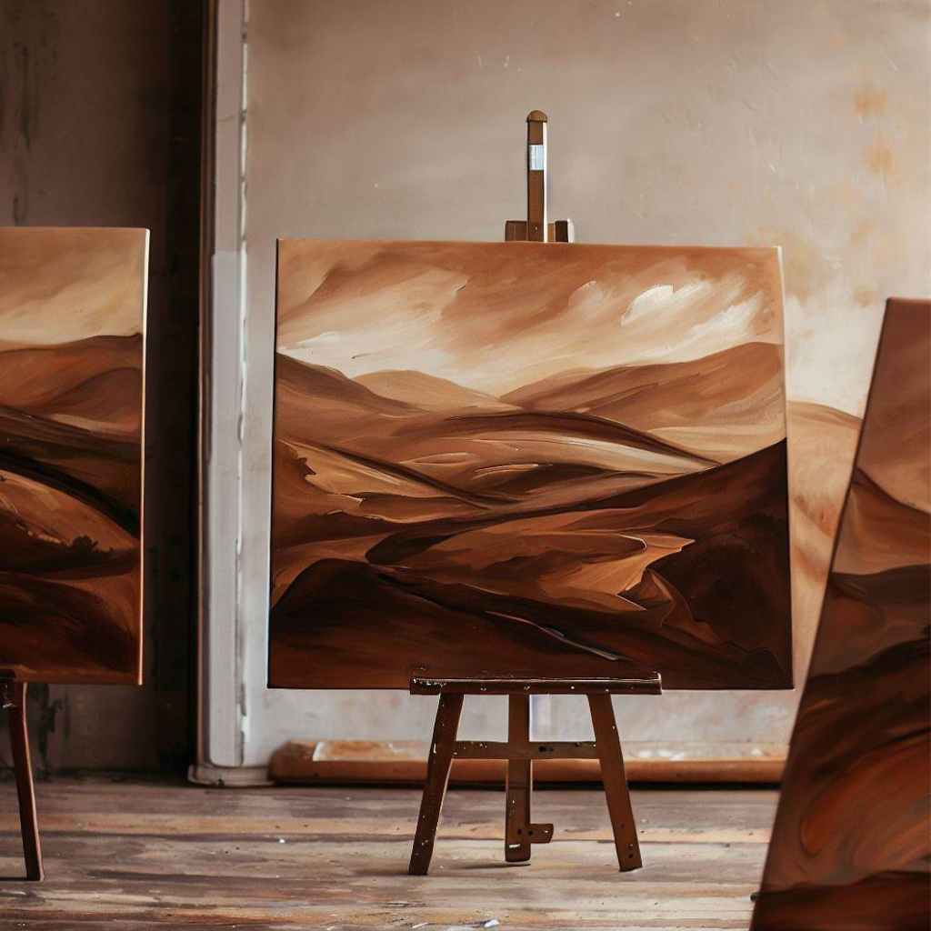
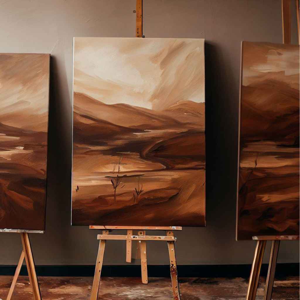
For landscapes, an underpainting with earthy tones can establish the base for natural elements like trees and rocks. Experiment with different color choices and techniques to see how underpainting can enhance your specific subject matter.
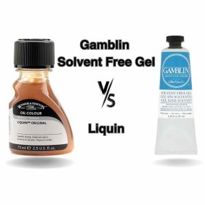
wdaniels from WetCanvas recommended thinning some burnt umber down with Liquin and wiping it on the painting with a rag after drying.
Value Adjustments
Value refers to the lightness or darkness of a color. Adjusting values can help you tone down colors by either darkening or lightening them. By correctly balancing the values within your artwork, you can achieve a more harmonious and visually appealing result.
Using Grayscale Studies to Determine Value Relationships:
Grayscale studies involve creating monochromatic representations of your artwork to focus solely on values.
By converting your color palette into shades of gray, you can better evaluate the tonal relationships between different elements in your composition.
This allows you to make informed decisions about which colors need toning down and how to adjust their values effectively.
Utilize color temperature. Color temperature refers to the perceived warmth or coolness of a color. By adjusting the color temperature of certain areas, you can indirectly affect their values. Warm colors tend to appear brighter, while cool colors appear darker.
There are several techniques you can use to adjust values in acrylic paintings:
- For darkening colors, you can layer on darker shades or glaze with transparent dark colors.
- For lightening colors, you can mix in white or use dry brushing to apply lighter strokes selectively.
- Additionally, you can use scumbling or blending techniques to create transitional values between areas of different intensities.
Troubleshooting Common Issues
When working with acrylic painting, it’s important to be aware of common issues that may arise and affect the quality of your artwork.
Over Blending and loss of vibrancy: How to maintain color integrity
Over Blending can lead to a loss of vibrancy in your colors. To maintain color integrity, it’s recommended to practice controlled blending techniques.
Be mindful of how much you blend, working in small sections and blending only as much as needed to achieve the desired effect while preserving the vibrancy of the colors.
Additionally, instead of blending colors directly on the canvas, consider layering them. By layering thin coats of paint, you allow the underlying colors to show through, retaining their vibrancy while achieving a harmonious blend.
Avoiding muddy mixes and achieving clarity in tones
Muddy mixes can result in unclear and dull tones. To avoid muddy mixes and achieve clarity in tones, it’s crucial to keep your brushes and palettes clean.
Regularly rinse your brushes between color changes and use separate wells or palettes for different colors to prevent color contamination. Limiting your color palette can also help.
By working with a select range of colors, you gain better control and enhance clarity in your tones. It’s also beneficial to practice color mixing, experimenting with different combinations in small quantities. This allows you to understand how colors interact and avoid creating muddy or dull mixes.
Fixing color imbalances and achieving harmony in the artwork
Color imbalances can disrupt the harmony of your artwork. To address such imbalances and achieve harmony, it’s essential to assess color relationships within your piece. Identify areas where certain colors overpower others and adjust the values accordingly.
Darkening or lightening specific colors can bring balance and create a more harmonious composition. Exploring color harmonies, such as complementary or analogous color schemes, is another effective way to establish cohesion in your artwork. These harmonious combinations of colors work together to create a unified and visually pleasing composition.
Seeking feedback from fellow artists or trusted individuals and engaging in self-reflection can also help identify color-related issues and guide you in finding solutions to achieve overall harmony in your artwork.
FAQs
- Can I tone down the colors after the painting is completed?
While it’s preferable to tone down colors during the painting process, adjustments can be made even after the artwork is finished. Techniques like glazing or dry brushing can be used selectively to modify specific areas or create subtle shifts in color.
- Can toning down colors affect the archival quality of the artwork?
When using high-quality acrylic paints and following proper techniques, toning down colors should not significantly affect the archival quality of the artwork. However, it’s always recommended to use artist-grade materials and follow best practices to ensure the longevity of your artwork.
- Can toning down colors be used to create a specific mood or atmosphere in a painting?
Yes, toning down colors can be a powerful tool for creating specific moods or atmospheres in your paintings. Subtle shifts in color intensity can evoke different emotions and set the tone for the overall artwork.
- Can toning down colors be applied to abstract or non-representational paintings?
Absolutely! Toning down colors can be used in abstract or non-representational paintings to create subtle shifts in color harmony, depth, and visual interest. It can add a sense of balance and cohesiveness to the overall composition, enhancing the impact of the artwork.
- Can toning down colors be used to create a focal point in a painting?
Yes, toning down colors strategically can help create a focal point by emphasizing a specific area of the painting. By reducing the intensity of surrounding colors, you can draw attention to a particular subject or element, enhancing its impact on the composition.
Wrapping up
As we come to the end of this illuminating journey on how to tone down colors in acrylic painting, it’s time to reflect on the valuable insights we’ve gained.
Throughout this comprehensive guide, we have explored a myriad of techniques and principles that empower you to achieve a harmonious balance in your artwork.
Armed with the knowledge of color theory, the right tools and materials, and a spirit of experimentation, you are now equipped to embark on your own artistic journey with confidence and creativity.
So go forth, unleash your imagination, and let your acrylic paintings exude depth, harmony, and artistic brilliance.
Remember, the power to tone down colors and create captivating masterpieces lies in your hands. Take action and let your artistic vision shine!